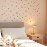
Your personal sanctuary deserves special attention. A thoughtful color palette can completely change how your space feels and functions.
This guide brings you expert design ideas from top professionals. You’ll discover both timeless combinations and fresh, unique approaches.
We explore more than just wall colors. Learn creative ways to incorporate color through accents, textiles, and special painting techniques.
Whether you want a cozy retreat or an energetic space, color sets the perfect tone. Even small changes can make a huge impact in your home.
Get ready to find inspiration that matches your personal style. Let’s create a room that truly reflects you!
Why Your Bedroom’s Color Palette Matters for Serenity and Style
The colors you choose for your sleeping space do more than just decorate walls – they shape your daily mood and relaxation. A thoughtful approach to your room’s color palette creates harmony where chaos might otherwise reign.
Imagine transforming a cluttered area into a peaceful sanctuary. This happens when you select 2-4 complementary shades instead of many competing hues. Your space becomes cohesive rather than chaotic.
Professional designers often recommend limiting your main colors. This creates intention in your design rather than randomness. Your furniture, bedding, and accessories work together beautifully.
Consider a creamy white base with subtle red accents. This combination offers flexibility while maintaining elegance. You can change accent pieces over time without repainting.
Color psychology plays a significant role in your room’s atmosphere. Blues and greens naturally promote calmness and rest. Warmer tones add energy and comfort when used strategically.
Your personal style should guide these choices while considering the room’s purpose. The right combination makes your space feel both restful and reflective of you.
A well-planned palette can visually expand a smaller area or add cozy intimacy to a larger one. Even guest rooms benefit from this thoughtful approach, making visitors feel immediately welcome.
View color selection as creative self-expression. This transforms your sleeping area into a true personal haven. The investment of time pays off in daily comfort and visual pleasure.
Your home deserves this level of consideration. The right colors create sanctuary-like quality in your most private space.
Finding Your Perfect Bedroom Vibe: Warm, Cool, or Neutral?

Choosing between warm, cool, or neutral tones sets the foundation for your entire room’s atmosphere. Each category creates a distinct emotional experience that transforms how your space feels.
Warm shades like burnt orange or deep burgundy create intimate coziness. Use muted or rich versions to avoid overstimulation. These hues work beautifully for creating a welcoming retreat.
Cool colors such as blues and greens promote calmness and relaxation. They benefit from warm accents like wood furniture to ground the space. This balance creates harmony in your design.
Neutrals like gray, white, and black offer incredible flexibility. They serve as restful backdrops for personal touches. These tones can lean warm or cool depending on your palette.
How Light and Room Size Should Influence Your Color Choice
Natural light and room dimensions dramatically affect color perception. Understanding this relationship ensures your choice works in real conditions.
Spacious, well-lit rooms can handle darker colors beautifully. Deep tones add coziness to large areas. They create intimate atmospheres in sunny spaces.
Small or dim rooms benefit from light colors. Pale tones enhance brightness and expand perceived space. They make compact areas feel more open.
Always test paint patches in different lighting conditions. Colors change throughout the day with natural light shifts. This prevents surprises after painting.
“The right color doesn’t just decorate walls—it transforms how you experience a room throughout the day.”
Assess your room’s orientation before committing to colors. North-facing rooms receive cooler light. South-facing spaces enjoy warmer, brighter illumination.
Real-world examples show these principles in action. Benjamin Moore’s Chantilly Lace brightens small rooms effectively. Deep greens perfect large, sunny spaces with character.
| Color Category | Best For Room Types | Lighting Considerations | Atmosphere Created |
|---|---|---|---|
| Warm Tones | Large rooms, north-facing | Adds warmth to cool light | Cozy, intimate, welcoming |
| Cool Tones | Sunny rooms, south-facing | Balances bright light | Calm, serene, refreshing |
| Neutral Tones | Any room size or light | Adapts to all conditions | Versatile, restful, balanced |
Understanding these factors helps create a space that looks beautiful and feels right. Your bedroom should support relaxation and daily life perfectly.
The right combination of color, light, and space creates your ideal personal retreat. Thoughtful choices make your room both functional and emotionally satisfying.
Embracing the Deep: Moody Blues for a Cocoon-Like Retreat
Blue hues offer more than just visual appeal—they transform your space emotionally. These shades create a cocoon-like retreat that feels both secure and tranquil.
Designer Ali Henrie demonstrates this beautifully with Knoxville Gray. This deep blue from Benjamin Moore forms a rich base for warm accents.
Rust-colored linens and wooden nightstands complement this shade perfectly. Vintage artwork adds the final touch to this inspired design.
Knoxville Gray: A Deep Blue Base for Warm Accents
This sophisticated shade works wonderfully in well-lit rooms. It adds cozy intimacy without feeling overwhelming.
Pair it with warm textiles to prevent a cold feel. Metallic touches bring elegant contrast to the deep blue walls.
St. Giles Blue: A Vibrant and Comforting Accent Wall
Farrow & Ball’s vibrant blue draws inspiration from art. Picasso’s beach paintings influenced this comforting shade.
Use it on a single wall for creative impact. This approach adds color without dominating your entire space.
Newbury Port Blue: A Relaxing and Calming Neutral Blue
Benjamin Moore’s neutral blue promotes perfect relaxation. It creates a soothing atmosphere for guest rooms.
This versatile shade adapts to various lighting conditions. It maintains its calming effect throughout the day.
Santa Monica Blue: A Fun, Cool Tone for a Youthful Space
This cool blue tone brings playful energy to rooms. It’s ideal for teen spaces seeking personality.
Pair it with ceiling wallpaper for enhanced theme. The combination creates a fun, cohesive look.
Blue remains a timeless choice for personal retreats. When chosen thoughtfully, it delivers both style and serenity.
“Blue’s versatility ranges from traditional to modern, depending on shade and application. It’s one of the most adaptable colors for bedroom spaces.”
Consider starting with an accent wall if full commitment feels too bold. This approach lets you experiment with blue’s transformative power.
Your room deserves this level of color consideration. The right blue shade creates that perfect sanctuary feel.
Bringing the Outside In: Nature-Inspired Green Hues

Nature’s most versatile shade brings life and tranquility to your personal space. Green hues create an organic connection to the outdoors while promoting deep relaxation.
These earthy tones range from subtle sage to deep forest. Each variation offers unique emotional benefits for your sleeping area.
Green works beautifully in various lighting conditions. It adapts to both natural and artificial light throughout the day.
Green Smoke: A Soothing Green That Transforms Throughout the Day
Farrow & Ball’s Green Smoke creates a cozy, calm atmosphere. This sophisticated shade shifts beautifully with changing light.
Morning sunlight reveals subtle gray undertones. Evening light brings out its warmer, earthier qualities.
This dynamic quality makes your space feel alive. It’s perfect for creating a restful yet interesting bedroom environment.
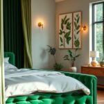
Hunter Green: A Bold Backdrop for Strong Accents
Benjamin Moore’s Hunter Green makes a powerful statement. This saturated shade creates depth and drama on feature walls.
Pair it with vibrant accents like chartreuse velvet bedding. The contrast adds energy while maintaining sophistication.
This deep green works particularly well in spacious rooms. It adds cozy intimacy without feeling overwhelming.
Dragonfly: An Old-World Green That Evokes Comfort and Luxury
Benjamin Moore’s Dragonfly offers timeless elegance. Its rich, complex tone suggests heritage and quality.
This shade creates instant sophistication in any sleeping space. It pairs beautifully with wood furniture and metallic accents.
The luxurious feel makes it perfect for master suites. It transforms ordinary rooms into exceptional retreats.
Rockwood Jade: A Fresh Pop of Green on Trim and Molding
Sherwin-Williams’ Rockwood Jade brings playful energy. Use it on trim against crisp white walls for modern contrast.
This approach adds color without overwhelming your space. It creates visual interest while maintaining airiness.
Pair with blue and brown accents for a cohesive look. The combination feels both fresh and grounded.
“Green’s connection to nature makes it inherently calming. It’s the perfect bridge between vibrant energy and peaceful relaxation.”
Consider these pairing ideas for your green palette:
- Natural wood nightstands for earthy texture
- Jute or sisal rugs for organic elements
- Potted plants to enhance the nature theme
- Woven baskets for additional natural texture
Green offers incredible versatility for your personal sanctuary. From muted serenity to bold statements, it creates spaces that feel both refreshing and deeply comforting.
Test samples in your actual lighting before committing. See how these beautiful greens transform your room throughout the day.
The Power of Neutrals: Creating a Calm and Versatile Base
Neutral colors form the foundation of truly restful personal spaces. These subtle shades create peaceful environments that adapt to your changing style.
They offer incredible flexibility for your room design. You can refresh your look simply by changing accessories and textiles.
Designer Lara Apelian frequently uses Benjamin Moore’s Dove Wing. This warm white creates balanced backdrops for artwork and decor.
It promotes restfulness while maintaining visual interest. The warm undertones prevent sterile or clinical feelings.
Dove Wing: A Warm, Balanced White for a Restful Space
This sophisticated white works beautifully in various lighting conditions. It provides perfect balance for your artistic elements.
The warm tone creates cozy atmosphere without yellow undertones. Your space feels both fresh and inviting.
Navajo White: A Refined, Calming Hue for Antique Furniture
Benjamin Moore’s Navajo White complements traditional pieces beautifully. It enhances wood floors and antique furniture.
This refined hue adds elegance to any sleeping area. The calming quality makes it perfect for creating serene retreats.
Revere Pewter: An Iconic, Versatile Gray for Layering
This iconic gray works with both warm and cool accents. Layer it with blue headboards or taupe pillows.
The versatile nature makes it ideal for evolving design schemes. You can change your look seasonally.
Calm: A Literally Tranquil and Cool Neutral Base
Benjamin Moore’s Calm offers cool, tranquil undertones. It serves as perfect base for metallic accents.
Pair it with darker grays for added depth. This combination creates sophisticated, peaceful environments.
Neutrals provide blank canvas for personal expression. Introduce color through bedding and art without commitment.
This approach lets you experiment with different palette combinations. Your space remains adaptable over time.
| Neutral Type | Best For Lighting | Room Size | Recommended Pairings |
|---|---|---|---|
| Warm Neutrals | North-facing rooms | Small to medium | Wood tones, cream textiles |
| Cool Neutrals | South-facing rooms | Large spaces | Metallics, darker accents |
| Versatile Grays | Any orientation | All sizes | Blue accents, layered textures |
Consider your room’s light exposure when choosing neutrals. Warmer options add coziness to dim areas.
Cooler versions maintain brightness in sun-filled spaces. Always test samples in your actual lighting.
Neutrals work across various design styles. Minimalist spaces benefit from added texture like grasscloth wallpaper.
Traditional rooms let furniture become the star feature. The neutral backdrop enhances rather than competes.
These color choices make rooms feel larger and more airy. They’re perfect for compact sleeping areas.
Limited natural light becomes less problematic. The right neutral maximizes whatever light exists.
“Neutrals provide the perfect foundation for personal expression—they’re the quiet background that lets your personality shine through decor and accessories.”
Your personal sanctuary deserves this thoughtful approach. Neutral bases create peaceful, adaptable environments.
They offer both timeless appeal and modern flexibility. Your space becomes effortlessly chic and completely yours.
Unexpected Warmths: Peach, Pink, and Lavender Tones

Think beyond traditional neutrals for your personal retreat. Soft peach, gentle pink, and dreamy lavender bring surprising warmth to your space.
These hues create inviting atmospheres without feeling overly sweet. They offer sophisticated alternatives to standard color choices.
Natural light enhances their warm undertones beautifully. Your room gains cheerful ambiance throughout the day.
Light Peachblossom: A Soft Pink Balanced with Dark Blue
Little Greene’s Light Peachblossom offers delicate charm. This soft pink creates gentle contrast with dark blue elements.
Pair it with navy headboards or matte black light fixtures. The combination feels both harmonious and stylish.
This balanced approach prevents overly feminine feel. Your space gains personality without sacrificing sophistication.
A Peachy-Pink Glow Enhanced by Natural Textures
Peachy-pink hues radiate cozy warmth in any sleeping area. They glow beautifully alongside natural materials.
Jute rugs and wood ceilings amplify their organic charm. Woven shades add complementary texture.
This combination creates relaxed, laidback atmosphere. Your room feels both intentional and effortless.
Lavender Headboard: A Modern, Soft, and Unexpected Focal Point
Farrow & Ball’s Brassica makes a stunning statement. This lavender shade offers modern softness on focal pieces.
Use it on your headboard against neutral wallpaper. The pairing maintains cozy sophistication.
This unexpected choice adds artistic touch to your design. It transforms ordinary furniture into conversation pieces.
Pink Ground: A Sweet and Sophisticated Evolving Pink
Farrow & Ball’s Pink Ground grows with your space. This versatile pink suits both children’s rooms and adult retreats.
Its sophisticated tone pairs beautifully with light woods. Cream accents enhance its evolving character.
This shade maintains sweetness without childishness. Your room gains timeless appeal through color.
“These warm tones challenge conventional bedroom palettes while delivering exceptional comfort and visual interest.”
Incorporate these colors through strategic accents if full commitment feels too bold. Try peach bedding or lavender throw pillows first.
Artwork featuring these hues adds subtle touch without overwhelming. You can always expand your color presence later.
Designers often balance peachy-pink walls with teal or green accents. This prevents one-note look while adding depth.
Your personal sanctuary deserves this creative exploration. These warm tones add personality and comfort in truly memorable ways.
Bold and Energetic Statements: Yellows and Mustards
Brighten your personal retreat with the cheerful energy of yellow tones. These vibrant shades bring instant happiness and warmth to your sleeping area.
Yellow works wonderfully for spaces needing an uplifting boost. It creates an inviting atmosphere that feels both energetic and comforting.
Designers often recommend mustard or muted yellow for bedrooms. These sophisticated versions prevent overwhelming brightness.
Your space gains personality without sacrificing relaxation. The right yellow shade transforms ordinary rooms into joyful retreats.
Sunny Yellow Tempered with Sophisticated Neutrals
Balance vibrant yellow with calming neutrals for perfect harmony. Gray wallpaper or creamy headboards prevent juvenile feelings.
This combination maintains serenity while adding cheerful touches. Your room feels both sophisticated and inviting.
Consider Benjamin Moore’s Hawthorne Yellow with warm grays. This pairing creates visual interest without chaos.
Natural wood furniture grounds the bright color beautifully. The overall effect feels both energetic and restful.
Vibrant Yellow Touches Balanced by Soothing Whites
White walls provide perfect backdrop for yellow accents. This combination keeps your space feeling fresh and airy.
Schumacher-patterned curtains add vibrant touches against white backgrounds. The look remains calm despite colorful elements.
Guest bedrooms benefit particularly from this approach. Visitors enjoy cheerful energy without sensory overload.
White trim frames yellow walls beautifully. This creates intentional design rather than random color placement.
Incorporate yellow through smaller elements if painting feels overwhelming. Decorative pillows or lampshades add cheerful touches.
You can always expand your color presence later. This approach lets you experiment with yellow’s transformative power.
“Yellow brings sunlight into rooms even on cloudy days. Used thoughtfully, it creates spaces that feel both happy and harmonious.”
Natural materials help ground yellow’s energetic quality. Wicker baskets or wood nightstands add complementary texture.
These elements prevent the color from feeling too intense. Your space gains balanced, cohesive design.
Yellow pairs beautifully with cool tones for added interest. Blue or green accents create refreshing contrast.
This combination adds visual depth without overwhelming your senses. Your room feels both vibrant and restful.
| Yellow Type | Best Placement | Ideal Pairings | Atmosphere Created |
|---|---|---|---|
| Mustard Yellow | Accent walls, bedding | Gray neutrals, wood tones | Cozy, sophisticated, inviting |
| Sunny Yellow | Decorative accessories | White backgrounds, blue accents | Cheerful, fresh, energetic |
| Muted Yellow | Furniture pieces | Creamy neutrals, green touches | Warm, balanced, relaxing |
Consider your room’s lighting when choosing yellow shades. North-facing spaces benefit from warmer mustard tones.
South-facing rooms can handle brighter versions beautifully. Always test samples in your actual lighting conditions.
Yellow works across various design styles from modern to traditional. The shade and application determine the final look.
Your personal sanctuary deserves this joyful color exploration. Yellow brings unique energy and warmth to your most private space.
20 Bedroom Colour Ideas That Transform a Room with Accent Walls

One powerful wall can completely redefine your sleeping area’s atmosphere. Accent walls offer a smart approach to introducing bold hues without overwhelming your entire room.
This technique creates instant focal points and visual interest. You achieve maximum impact with minimal effort and investment.
The DIY Approach: Sky Blue, Burgundy, and Brown Palette
Designer Ryia Jose demonstrates this beautifully in a guest bedroom. She combines Sherwin-Williams’ Waterloo and Blustery Sky for a calming base.
Rich burgundy and warm brown textiles add cozy contrast. Vintage artwork completes this sophisticated look.
This palette creates both serenity and warmth simultaneously. The combination feels both refreshing and grounded.
Consider these elements for your DIY project:
- Test paint samples in different lighting conditions
- Choose complementary textiles for warmth
- Select artwork that enhances your color story
- Layer textures for added visual depth
Wallpaper Murals: Communicating Your Theme with Art
Schumacher murals offer an alternative to painted accents. These artistic installations communicate specific themes beautifully.
Nature-inspired patterns with green motifs create organic connections. Peach accents add warm contrast to the botanical themes.
Murals often incorporate multiple colors and patterns. This reduces the need for additional artwork or decor elements.
Select the right wall for maximum impact. The wall behind your bed makes a natural focal point.
Architectural features like fireplaces or alcoves work beautifully. These elements enhance your accent wall’s visual importance.
Darker colors add cozy intimacy to spacious rooms. Lighter shades enhance openness in compact areas.
Always consider your existing furniture and bedding. Your accent color should complement rather than clash.
“An accent wall serves as artistic expression within your personal sanctuary—it’s the perfect balance of bold statement and controlled design.”
Wallpaper offers incredible texture and pattern possibilities. Grasscloth varieties add organic depth.
Geometric designs create modern energy. Floral patterns bring soft, romantic feelings.
This approach works for various design styles and budgets. You can achieve dramatic transformations quickly.
Your sleeping space gains personality and character. The right accent wall makes your room uniquely yours.
Thinking Beyond the Walls: Creative Ways to Add Color
Walls aren’t the only place to express your personal style. Smart color choices in fabrics and decor create flexible, impactful transformations.
This approach lets you experiment without permanent changes. You can refresh your space seasonally or as your tastes evolve.
Textiles and accessories offer wonderful opportunities for creativity. They add personality while maintaining overall harmony.
Color Through Drapery and a Beautiful Headboard
Window treatments make dramatic style statements. Patterned curtains introduce vibrant hues without painting.
Green botanical prints bring nature-inspired freshness. Pink floral patterns add soft, romantic energy.
Your headboard serves as another fantastic focal point. A colorful piece sets the tone for your entire space.
Designer Ginny Macdonald demonstrates this beautifully. She selects headboards that complement her overall color story.
This approach works particularly well for rental homes. You achieve personalized style without violating lease agreements.
Incorporating Smaller Red Accents on a Neutral Base
Creamy white walls provide perfect backdrop for bold touches. Red pillows or artwork create exciting visual interest.
This combination maintains flexibility for future changes. You can swap accents when wanting fresh energy.
Start with one or two vibrant elements first. Add more if you enjoy the dynamic look they create.
Red works beautifully against vanilla backgrounds. The contrast feels both sophisticated and energetic.
Consider these creative approaches for adding color:
- Patterned area rugs with multiple hues
- Throw blankets in complementary shades
- Decorative pillows for quick color changes
- Artwork that introduces your favorite tones
Balance remains important when working with accents. Too many competing elements create visual chaos.
Choose one dominant color for larger pieces. Use smaller accessories for complementary shades.
| Accent Type | Best For | Flexibility Level | Impact Level |
|---|---|---|---|
| Textiles | Quick changes | High | Medium |
| Headboard | Focal point | Medium | High |
| Artwork | Personal expression | High | Medium |
| Accessories | Seasonal updates | Very High | Low to Medium |
View your sleeping space holistically when planning accents. Consider how colors work together throughout the room.
Textures add another dimension to your design. Woven baskets or knitted throws enhance visual interest.
“The most successful rooms often feature a mix of permanent and temporary color elements—this balance allows for both consistency and creativity.”
These approaches open wonderful possibilities for personalization. Your space becomes uniquely yours without major commitments.
Experiment freely and have fun with the process. Color should bring joy and reflection of your personality.
The Magic of Two-Tone and Textured Paint Techniques

Elevate your walls beyond basic solid colors with creative painting methods. These innovative approaches add remarkable visual interest and sophistication to any sleeping area.
Two-tone and textured finishes provide unique character without overwhelming your space. They create custom looks that feel both intentional and artistic.
Stone Washing for Organic Texture and Visual Depth
Stone washing creates a beautifully organic finish on your walls. This technique adds subtle texture and depth without bold patterns.
It works wonderfully for creating calming atmospheres in your personal retreat. The method involves applying multiple translucent layers of paint.
Each layer builds upon the previous one for rich dimension. The result feels both natural and intentionally designed.
This approach serves as an excellent alternative to traditional flat paint. It adds character to neutral color palettes beautifully.
Earthy tones enhance the natural vibe of stone washing. Your room gains cozy, retreat-like quality through this method.
Gray-and-White Combo for an Elegant, Widening Effect
The gray-and-white two-tone combination creates elegant sophistication. Applied horizontally, it produces a widening effect that expands your space visually.
The gray lower half grounds the room with stability. The white upper portion enhances brightness and airiness.
This technique works particularly well for compact sleeping areas. It makes smaller rooms feel more spacious and dynamic.
Consider using wainscoting or beadboard to define the sections. This adds architectural interest and reduces the need for additional artwork.
These painting methods offer perfect middle ground between plain walls and busy wallpapers. They provide subtle sophistication that complements various decor styles.
“Textured paint techniques add custom, high-end character to rooms without significant cost or renovation effort.”
Implementing these ideas requires minimal investment compared to major changes. You achieve dramatic transformation through creative painting approaches.
Always test samples in your actual lighting conditions. See how textures and two-tone effects work throughout the day.
Your sleeping area gains unique personality and style. These techniques transform ordinary walls into artistic features.
Enjoy the process of creating something truly special. Your personal sanctuary deserves this level of creative attention.
Creating Depth and Interest with Dark and Moody Palettes
Dark shades bring sophistication and coziness to your personal retreat. These rich tones create dramatic backdrops that make other elements shine beautifully.
Moody color choices add instant character to any sleeping area. They transform ordinary spaces into intimate, luxurious environments.
Well-planned dark palettes prevent rooms from feeling too closed-in. The right balance maintains brightness while adding depth.
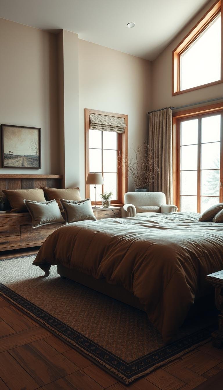
Charcoal Walls for a Dramatic, Intimate Ambiance
Charcoal creates a stunning, sophisticated background in your sleeping space. This deep gray shade adds warmth and drama simultaneously.
Pair it with light bedding and warm wood furniture. The contrast prevents the room from feeling too dark or heavy.
Designers often use charcoal in traditional settings. It makes vintage furniture and plush materials stand out beautifully.
This color works particularly well in large, well-lit areas. It adds cozy intimacy without overwhelming the space.
Hand-Painted Wallcovering for Color and Velvety Texture
Porter Teleo’s hand-painted wallcoverings offer unique texture and richness. These artistic finishes add velvety depth without bold patterns.
The subtle variations in color create dynamic visual interest. Your walls gain character that flat paint cannot achieve.
This approach enhances moody atmospheres beautifully. The textured surface plays with light throughout the day.
Consider these tips for incorporating dark shades:
- Use mirrors to reflect light and maintain brightness
- Add metallic accents for warmth and sophistication
- Incorporate textured fabrics like velvet or wool
- Test paint patches in your actual lighting conditions
Dark walls create wonderful cocoon-like effects. They promote relaxation and better sleep in your personal sanctuary.
Start with an accent wall if full commitment feels too bold. This approach adds drama without overwhelming your entire room.
Even ceilings can handle dark colors beautifully. This unexpected choice adds architectural interest overhead.
“Dark palettes offer both bold statement and restful retreat—they’re the perfect contradiction that creates truly memorable spaces.”
Your sleeping area deserves this level of design consideration. Moody colors create spaces that feel both dramatic and deeply comforting.
The right combination makes your room uniquely yours. It reflects personal style while promoting perfect relaxation.
Designer-Approved Color Combinations for a Cohesive Look
Creating a harmonious atmosphere in your sleeping area involves more than picking a single shade. Professional designers often combine colors in specific ways to achieve both visual appeal and emotional balance.
These combinations ensure your space feels intentional rather than random. They create sophisticated environments that support relaxation and personal expression.
Understanding these pairings helps you build a cohesive look. Your room gains professional polish through thoughtful color relationships.
Navy, Gold, and White: A Refined and Luxurious Trio
This classic combination delivers both elegance and comfort in your personal retreat. Navy creates a cozy, enveloping backdrop that feels both secure and sophisticated.
Gold accents introduce warmth and glamour through metallic touches. Think framed mirrors, lamp bases, or decorative objects.
Crisp white balances the richness of these deeper tones. It prevents the space from feeling too dark or heavy.
This trio works beautifully in traditional and contemporary settings. The combination feels both timeless and currently stylish.
Balancing a Saturated Blue with Creams and Dusty Roses
Sherwin-Williams’ Debonair serves as an excellent saturated blue choice. This rich shade creates depth and character on feature walls.
Soft cream tones prevent the blue from overwhelming your space. They add lightness and balance to the bold color.
Dusty rose accents introduce warm contrast against the cool blue. This pairing creates visual interest without conflict.
The combination feels both refreshing and comforting simultaneously. Your room gains personality through this harmonious balance.
Consider these additional successful pairings from design experts:
- Green and pink combinations that evoke natural warmth
- Neutrals layered with metallic accents for sophistication
- Earth tones paired with crisp whites for fresh contrast
The 60-30-10 rule helps achieve perfect proportion in your design. Use 60% for your dominant color, 30% for secondary shades, and 10% for accents.
This approach creates visual harmony without overwhelming your senses. Your space feels both balanced and intentionally designed.
Texture plays a crucial role in successful color combinations. Velvet bedding against matte walls adds depth and interest.
Glossy finishes reflect light differently than flat surfaces. These variations enhance your chosen palette beautifully.
“The most successful rooms feature color relationships that feel both intentional and effortless—they create spaces that are visually cohesive and emotionally satisfying.”
These combinations work across various style preferences and room sizes. You can adapt them to your existing furniture and lighting conditions.
Draw inspiration from these pairings while making them your own. Your personal sanctuary should reflect your unique taste and needs.
Designer-approved combinations remove the guesswork from color selection. They result in spaces that are both beautiful and perfectly functional.
Your sleeping area becomes a true reflection of sophisticated design thinking. Enjoy the process of creating something truly special.
Transforming a Bedroom Nook with a Dreamy Color Scheme
That special corner in your sleeping area holds incredible potential. With the right color approach, you can create a magical retreat within your larger room.
These cozy spots become personal sanctuaries for reading or relaxing. A thoughtful palette enhances their intimate nature beautifully.
Lavender with Gray Undertones for an Ultimate Dreamscape
Farrow & Ball’s Brassica offers sophisticated lavender with subtle gray notes. This complex shade creates a soft, dreamy atmosphere perfect for relaxation.
The gray undertones prevent the purple from feeling too sweet. Your nook gains serene elegance rather than childish whimsy.
This color works wonderfully in reading nooks or meditation areas. It promotes calm focus and peaceful contemplation.
Designers often use this shade in converted closet spaces. Custom lavender woodwork transforms unused areas into book-friendly retreats.
Balance the purple with warm peach bedding or yellow throw pillows. These complementary accents add cheerful contrast.
The combination prevents visual monotony while maintaining harmony. Your small space feels both cohesive and interesting.
Consider your nook’s purpose when selecting colors. Calming hues like lavender suit relaxation areas perfectly.
Energizing tones might work better for creative corners. Match your color choice to the nook’s primary function.
Light colors generally make small areas feel more spacious. Darker shades add cozy intimacy to compact nooks.
These limited spaces are perfect for bold color experiments. Their small size reduces commitment while allowing creative expression.
Always assess natural light before finalizing your choice. North-facing nooks might need warmer versions of your selected hue.
Add texture through woven blankets or velvet pillows. These elements make your nook feel inviting and layered.
Even the smallest footprint can become a favorite retreat. A well-designed nook offers perfect escape within your own bedroom.
“The most successful nooks combine color, texture, and function—they become cherished spots that enhance daily life through thoughtful design.”
Your personal sanctuary deserves these special touches. A dreamy nook color scheme creates spaces for both relaxation and inspiration.
How to Test and Choose Your Paint Color Like a Pro
Making the final color decision can feel overwhelming, but professional techniques simplify the process. These expert methods ensure your chosen hue works perfectly in your space.
Testing and coordination prevent costly mistakes and regrets. You achieve a cohesive look that enhances both comfort and style.
The Non-Negotiable Importance of a Patch Test
Never skip painting large sample patches directly on your walls. Natural light and existing wall bases dramatically alter how paint appears.
Observe these patches at different times throughout the day. Morning, noon, and evening light reveal surprising color variations.
North-facing rooms receive cooler, bluer light that affects warmth perception. South-facing spaces enjoy warmer illumination that enhances certain tones.
Artificial lighting also changes color appearance significantly. According to color selection experts, warm white bulbs (2700-3000 Kelvin) make colors appear more yellow, while daylight bulbs (above 4500 Kelvin) add blue tones.
Test your samples for at least two to three days. This gives you time to see the color under various weather conditions too.
Coordinating Your Wall Color with Existing Décor
Your wall color should complement rather than compete with furniture and accents. Balance intense wall colors with neutral furnishings for harmonious results.
Neutral walls beautifully highlight antique wood pieces or colorful artwork. Bold walls often require simpler decor to avoid visual overload.
Consider your room’s primary purpose when selecting tones. Calming colors promote better sleep, while vibrant hues energize workspaces.
Paint sheen affects both color perception and overall feel. Matte finishes absorb light for richer depth, while gloss reflects light for brightness.
Test sheen options alongside your color choices. The same hue looks dramatically different in various finishes.
“The right color doesn’t just look good on a swatch—it creates harmony with your existing elements and enhances your daily experience of the space.”
Use color wheel apps for initial inspiration, but trust real-world testing for accuracy. Digital representations rarely match actual results.
Take your time with this important decision. Rushing often leads to disappointment and expensive repaints later.
Thorough testing and coordination result in a space that feels both aesthetically pleasing and perfectly functional. Your effort creates a personal sanctuary you’ll love for years.
Ready to Paint Your Perfect Personal Sanctuary?
You now have all the tools to create your dream retreat. The right color choice makes your space feel uniquely yours.
Start with confidence using these professional ideas. Remember to test samples in your actual lighting first.
Even small changes bring big impact. An accent wall or colorful textiles can transform your room gradually.
Every palette we’ve shared offers something special. Find what resonates with your personal style.
Painting remains one of the most affordable ways to refresh your home. The results immediately enhance daily life.
Trust your instincts and enjoy the process. Your perfect personal sanctuary awaits!