Have you ever dreamed of a personal retreat that feels both calming and sophisticated? Many homeowners are discovering the power of a neutral color scheme for their sleeping space. This approach creates a timeless foundation that adapts to your unique style.
The beauty of this palette lies in its incredible versatility. You can choose from light shades that make a room feel airy or deeper charcoal tones that create a cozy atmosphere. This flexibility works with various light conditions throughout your home.
Beyond aesthetics, these colors offer psychological benefits. They promote relaxation and better sleep by creating a stable, secure environment. Your bedroom becomes more than just a place to sleep—it transforms into a true sanctuary.
In this guide, we’ll explore how to select the perfect paint colors, textiles, and furniture pieces. You’ll learn to incorporate texture through fabrics like linen and velvet. We’ll also show you how to add warmth with wood accents and create focal points with statement headboards.
Get ready to discover practical ideas that blend elegance with comfort. Transform your sleeping space into a haven that reflects your personal taste while promoting ultimate relaxation.
Why Grey is the Perfect Choice for Your Bedroom Retreat

What makes grey such an exceptional choice for creating your perfect sleep sanctuary? This versatile neutral strikes a beautiful balance between light and dark tones. It creates a calming atmosphere that welcomes relaxation the moment you enter your personal space.
Psychologically, this color promotes feelings of stability and security. It helps calm your mind after a long day while maintaining an elegant backdrop. Your sleeping area becomes a true retreat from daily stresses.
The adaptability of this palette works with various design aesthetics. Whether you prefer modern minimalism or traditional charm, it provides a cohesive foundation. This flexibility lets your personal style shine through artwork and accessories.
Unlike trend-driven colors, this neutral choice maintains its timeless appeal. It won’t feel dated in a few years, making it a smart investment for your home. The sophisticated look remains fresh and inviting season after season.
Practical benefits include its ability to hide minor imperfections and create visual harmony. Different shades can make your room feel more spacious or intimate. Lighter tones reflect natural light beautifully while deeper hues create cozy intimacy.
Interior designers frequently recommend this color for sleeping spaces because it promotes quality rest. The balanced energy creates an environment where you can truly unwind. It transforms your most private room into a sanctuary that supports both relaxation and self-expression.
1. Understanding the Grey Spectrum: Choosing Your Shade

Have you ever stood in the paint aisle feeling overwhelmed by dozens of similar-looking options? The secret to choosing the perfect neutral lies in understanding undertones. Each shade carries subtle color influences that dramatically affect your space’s mood.
Cooler tones often have blue or green undertones. They create crisp, clean environments that feel refreshing and modern. Warmer variations might show hints of brown, purple, or taupe. These options bring cozy comfort to your personal retreat.
Light Greys for an Airy and Calming Sanctuary
Light neutral shades work magic in smaller spaces or rooms with limited natural light. They reflect illumination beautifully while maintaining sophistication. Popular choices include Pearl Grey, Silver Mist, and Dove Grey.
These pale color options create spa-like serenity. They help your mind unwind after busy days. The psychological effect is a space that feels both expansive and intimately peaceful.
Test samples on different walls at various times. Observe how morning sun versus evening artificial light changes the tone. This ensures your final choice works around the clock.
Dark and Charcoal Greys for Bold Sophistication
Deeper neutrals make powerful style statements. Charcoal and graphite shades create dramatic backdrops for contemporary designs. They work particularly well in larger rooms with abundant sunlight.
To prevent spaces from feeling heavy, balance dark walls with lighter furnishings. Incorporate reflective surfaces like mirrors and metallic accents. These elements bounce light around the room beautifully.
Deep charcoal creates intimacy in master suites. It transforms sleeping areas into cozy cocoons perfect for relaxation. This bold approach works across various design styles from industrial to traditional.
The Warmth of Greige: Balancing Grey and Beige
Greige has revolutionized neutral palette choices. This sophisticated blend combines grey’s cool modernity with beige’s inherent warmth. The result is exceptionally versatile and inviting.
This hybrid color solves the challenge of cool tones feeling too sterile. It creates nurturing environments that promote both rest and rejuvenation. Your space feels contemporary yet comfortably familiar.
Greige adapts to changing light conditions throughout the day. It maintains consistent warmth regardless of natural or artificial illumination. This reliability makes it increasingly popular for sleeping spaces.
When selecting your perfect paint, consider room orientation and existing furnishings. North-facing rooms benefit from warmer undertones. South-facing spaces can handle cooler variations without feeling chilly.
Always sample colors on your actual walls before committing. Observe them during morning, noon, and evening. This simple step ensures your chosen shade performs beautifully in your specific environment.
2. Laying the Foundation: Walls and Large Surfaces
Your walls create the canvas for your entire design vision. Choosing the right treatments sets the mood and establishes your room’s character. These large surfaces offer incredible opportunities to express your personal style while maintaining a cohesive look.
Thoughtful wall choices create harmony throughout your space. They work with your flooring, ceiling, and window treatments to establish visual flow. The right selections can make your room feel larger, cozier, or more dramatic.
Paint Finishes and Their Impact on Light
Paint finish dramatically changes how color appears in your space. Different sheens interact with light in unique ways. This affects both the ambiance and practical maintenance of your walls.
Matte finishes absorb light for a soft, non-reflective appearance. They hide imperfections beautifully but can be challenging to clean. Eggshell offers slight reflectivity with better durability for most rooms.
Satin finishes provide a gentle glow that brightens spaces. They work well in rooms with moderate natural light. Semi-gloss creates the most reflection, ideal for highlighting architectural details.
Consider your room’s size and light conditions when choosing. Smaller spaces benefit from lighter finishes that maximize brightness. Larger rooms can handle deeper sheens without feeling overwhelming.
Using Wallpaper for Texture and Pattern
Wallpaper introduces wonderful texture and visual interest to your design. Today’s options range from subtle textures to bold patterns. They can transform plain walls into stunning focal points.
Grasscloth wallpaper brings organic warmth with its natural fibers. Venetian plaster creates sophisticated depth with subtle variation. These textural choices add richness without overwhelming your space.
Patterned designs offer creative expression opportunities. Geometric patterns create modern energy. Tone-on-tone stripes add subtle dimension. Damask prints provide traditional elegance with contemporary appeal.
Consider using wallpaper on a single accent wall for dramatic effect. This approach creates focus without dominating the room. Alternatively, use it throughout for a cohesive, immersive experience.
Architectural details like board and batten add classic character. Fluted panels introduce modern sophistication. These elements create depth and dimension through shadow play.
Custom millwork painted in varying shades creates artistic effects. These treatments turn functional elements into design statements. They work particularly well in master suites where details become art.
Always test samples in your actual space before committing. Observe how treatments look at different times of day. This ensures your choices perform beautifully in your specific environment.
3. The Power of Textiles: Bedding and Soft Furnishings

Have you considered how fabric choices transform your sleep environment? Textiles create the tactile experience that makes your space feel truly inviting. They bring comfort and character to neutral spaces.
The right combinations can make your room feel warmer or cooler. They add visual interest through patterns and texture. Your selections should balance beauty with practical comfort.
Mixing Linens, Velvets, and Knits for Depth
Combine different materials for a rich, layered look. Linen offers casual elegance and breathability. It works beautifully for sheets and duvet covers.
Velvet brings luxury and depth to your arrangement. Use it for accent pillows or throws. The plush surface catches light beautifully.
Chunky knits introduce cozy texture and casual comfort. They work well as throw blankets at the foot of your bed. Mix these fabrics for a balanced, inviting feel.
The Art of the Layered Bed
Create a hotel-quality sleeping experience with careful layering. Start with high-quality sheets in natural fibers. Add a lightweight blanket for temperature control.
Build your pillows with purpose and variation. Use standard sleeping pillows as your foundation. Add Euro shams for height and structure.
Finish with decorative pillows in different sizes and textures. This creates visual interest and comfort. Remember to add warmth with a beautiful throw blanket.
Window treatments complete your textile story. Sheer curtains filter light softly. Blackout options ensure restful darkness when needed.
Your decor should feel both beautiful and functional. Choose fabrics that feel good against your skin. They should also withstand regular use and cleaning.
Seasonal changes keep your space feeling fresh year-round. Lightweight cottons work well for summer months. Heavier wools and knits provide winter coziness.
Proper care maintains your textiles’ beauty and longevity. Follow manufacturer instructions for cleaning. Rotate pieces to ensure even wear over time.
4. Selecting Furniture That Complements Your Grey Palette

Choosing the right furniture transforms your neutral space from basic to breathtaking. Your selections should enhance the calming atmosphere while providing practical function. The right pieces create harmony between aesthetics and everyday living.
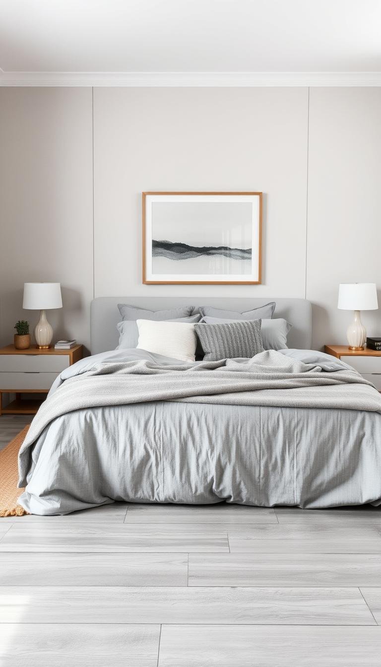
Modern and Minimalist Bed Frames as a Focal Point
Your bed naturally becomes the room’s centerpiece. Clean-lined designs create sophisticated foundations. They allow subtle color nuances to shine without competition.
Platform beds with low profiles work beautifully. They offer sleek silhouettes that emphasize space. Choose upholstered options in textured fabrics for added warmth.
A well-chosen headboard establishes your room’s character. Consider velvet in deep charcoal for luxury. Light linen versions create airy sophistication.
Mixed material designs combine different elements beautifully. Wood and metal accents add visual interest. These combinations create custom-looking pieces without the high cost.
Nightstands and Dressers: Function Meets Style
Your bedside table should balance form and function. It needs to hold essentials while complementing your bed. Scale matters greatly for visual harmony.
Glass-top options reflect light beautifully. They maintain an open, airy feeling. Matte finishes in white or black provide pleasing contrast.
Consider storage needs when selecting pieces. Some prefer open shelves for accessibility. Others want concealed storage for cleaner lines.
Floating shelves preserve floor space elegantly. They create streamlined appearances in smaller rooms. Built-in options offer customized solutions.
Dressers should offer ample organization. Look for smooth drawer operation and durable construction. Hand-painted details in tonal colors add artistic flair.
Additional furniture pieces complete your space. An accent chair in bouclé or wool adds texture. A bench at the foot of your bed provides seating and style.
Always measure your room before purchasing. Leave adequate walking space around each piece. This ensures both beauty and functionality in your daily life.
5. Illuminating Your Space: A Layered Lighting Strategy

Lighting creates the mood and functionality that makes your space truly special. A well-planned approach combines different sources to suit various activities and times of day. This strategy ensures your room always feels inviting and practical.
Harnessing and Enhancing Natural Light
Your walls respond beautifully to natural illumination, revealing subtle color depths. South-facing rooms receive warm, golden light that softens cooler tones. North-facing spaces get crisp, cool illumination that emphasizes clean edges.
Maximize natural brightness with strategic mirror placement opposite windows. Choose light-filtering window treatments that maintain privacy while welcoming sunshine. Painting window trim bright white amplifies incoming light throughout your space.
Keep furniture arrangements open near windows to avoid blocking precious sunlight. These simple adjustments help your color scheme shine at its best throughout daylight hours.
Ambient, Task, and Accent Lighting Fixtures
Ambient lighting provides overall illumination for your entire area. Dimmable recessed lights or a central pendant create flexible foundation lighting. Use 2700-3000K LED bulbs for warm, inviting glow.
Task lighting serves specific purposes like reading or dressing. Adjustable bedside sconces offer perfect illumination for nighttime reading. Position them at appropriate height for comfortable use.
Accent lighting highlights architectural features or artwork. Picture lights or LED strips behind headboards create dramatic focal points. These accents add depth and dimension to your design.
Choose fixtures that complement your overall style. Brass or copper finishes add warmth against cool tones. Crystal or glass elements create sparkle and reflection.
Matte black fixtures provide striking contrast against lighter walls. Sculptural pieces serve as artistic statements while providing function. Each choice contributes to your desired look.
Smart lighting systems offer incredible control over your environment. Program different scenes for morning routines, evening relaxation, or nighttime navigation. Voice-activated options provide convenience and flexibility.
Remember that lighting should enhance your experience without overwhelming it. The right balance creates a harmonious environment that supports both relaxation and functionality.
6. Introducing Pops of Color and Visual Interest
Have you ever wondered how to add personality to your neutral sanctuary? The right color choices can transform your space from simply calming to truly captivating. This approach lets you express your unique style while maintaining that peaceful atmosphere you love.
Your neutral foundation serves as the perfect backdrop for creative expression. It allows bold accents to shine without overwhelming your space. The magic lies in finding that perfect balance between serenity and self-expression.
Choosing Accent Colors That Pair Beautifully
Different shades work beautifully with various neutral tones. Light walls handle brighter, more vibrant pops of color beautifully. Deeper neutrals pair best with softer, more muted tones for harmonious results.
Consider these stunning combinations that professional designers love:
| Neutral Tone | Accent Color | Mood Created | Best Placement |
|---|---|---|---|
| Light Pearl | Emerald Green | Natural Sophistication | Textiles, Artwork |
| Medium Greige | Blush Pink | Soft Femininity | Accessories, Pillows |
| Charcoal | Mustard Yellow | Warm Energy | Throw Blankets, Art |
| Deep Graphite | Navy Blue | Timeless Elegance | Upholstery, Rugs |
| All Neutrals | Burgundy | Dramatic Luxury | Accent Chair, Drapery |
Color psychology plays a crucial role in your selections. Warm tones like mustard yellow create energy and warmth. Cooler shades like navy blue promote calmness and relaxation.
Think about the mood you want to create in your personal space. Do you prefer energizing mornings or ultra-relaxing evenings? Your color choices can support either preference beautifully.
Strategic Placement for Maximum Impact
Where you place your accents matters as much as which colors you choose. Start with smaller items that are easy to change. Throw pillows and artwork offer perfect testing grounds for new ideas.
Create focal points where the eye naturally travels. Your bed naturally becomes the room’s centerpiece. Add colorful bedding or an accent headboard for immediate impact.
Window treatments offer another excellent opportunity for color introduction. Consider colorful drapery panels that frame your windows beautifully. This approach adds visual interest without overwhelming your space.
Artwork provides perhaps the easiest way to experiment with new scheme options. You can change pieces seasonally to keep your space feeling fresh. This flexibility lets you test different palettes before committing to larger changes.
Remember that balance is key to successful design. Too much color can disrupt that serene feeling you’ve worked hard to create. Too little might leave your space feeling incomplete or impersonal.
Seasonal changes offer wonderful opportunities to refresh your look. Light, airy colors work beautifully for spring and summer. Richer, deeper tones create coziness for fall and winter months.
Start small and build your confidence with color. You might begin with a single accent pillow in your chosen hue. Gradually add more elements as you become comfortable with the new look.
The most successful designs feel intentional and cohesive. Choose 2-3 accent colors that work well together. Repeat them throughout your space for a polished, professional look.
Your personal sanctuary should reflect your unique personality. Don’t be afraid to experiment with colors that make you happy. The right combinations will transform your space into something truly special.
7. Grounding the Room: Rugs and Flooring
Have you considered how flooring choices complete your design vision? The right foundation ties everything together beautifully. It creates harmony between your walls, furniture, and accessories.
Hardwood floors bring natural warmth to your space. Light oak or walnut offer stunning contrast. They add organic texture that feels inviting underfoot.
Area rugs define specific zones within your room. They create cozy reading nooks or soft landing spots. Choose sizes that fit your layout perfectly.
Neutral rugs with subtle patterns add visual interest. They complement rather than compete with your scheme. Layering different textures creates depth and dimension.
Your rug should feel soft and comfortable for daily use. Natural fibers like wool provide durability and warmth. They also help with sound absorption in your home.
Proper maintenance keeps your flooring looking fresh. Regular vacuuming and occasional professional cleaning extend its life. Your choices should balance beauty with practical living.