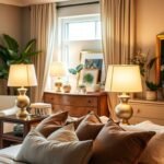
Welcome to your guide to creating a beautiful bedroom retreat. Your sleep space should be a personal sanctuary. The right color palette makes all the difference.
Discover how various hues and tones affect your mood and relaxation. Designers use specific paint colors to create calming or energizing environments.
Learn to balance wall colors with textures and patterns. Consider your room’s natural light and size. This helps you achieve a cohesive interior design.
Get inspired by earthy shades, muted colors, and timeless neutrals. Transform your home into a stylish, restful bedroom.
Why Your Bedroom Color Choice is More Important Than You Think
Your bedroom is more than just a place to sleep. It’s your personal retreat where you start and end each day. The colors you choose create an environment that affects your mood and well-being.
Think about how different shades make you feel. Some create calm while others bring energy. Your bedroom color selection impacts your daily life in subtle but powerful ways.
How Color Psychology Influences Your Sleep and Mood
Color psychology reveals how hues affect our emotions. Cool tones like blues and greens promote relaxation. They lower heart rates and prepare your body for rest.
Warm colors like reds and yellows create excitement. They stimulate conversation and activity. This makes them better for social spaces than sleeping areas.
Your bedroom should support quality sleep. The right paint colors on your walls can make this happen. They create a sense of peace that welcomes rest.
“The colors we live with directly influence our emotional state and sleep patterns.”
Creating Your Personal Sanctuary: Calm vs. Energized Spaces
Do you want a calm sanctuary or energized space? Your answer guides your color selection. Darker tones create intimacy and coziness.
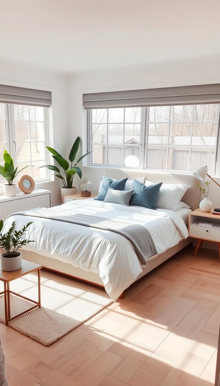
Lighter palettes make a room feel open and airy. They reflect natural light beautifully. This creates a fresh, awakening vibe each morning.
Consider your lifestyle when choosing paint. Night owls might prefer calming blues. Early risers may enjoy energizing yellows. The right balance supports your natural rhythms.
Your bedroom should feel like your perfect retreat. With thoughtful design choices, you can create a space that truly feels like home.
Serene and Grounding: The Enduring Appeal of Dark Green

Dark green creates a serene atmosphere in your personal retreat. This rich hue brings nature’s calming energy indoors. It transforms your bedroom into a peaceful sanctuary.
Green paint colors work beautifully in various light conditions. They create depth without making your room feel small. The right shade promotes relaxation and better sleep.
Why Designers Love Earthy Tones Like Caldwell Green
Designer Cheryl Clendenon recommends Benjamin Moore’s Caldwell Green for 2025. She notes this color feels grounding and restful. It creates a calm, inviting space to unwind.
Other popular greens include Peale Green and Tate Olive. These hues work with many design styles. They bring natural warmth to your interior.
Meredith Owen suggests Sherwin Williams’ Thunderous. This paint has earthy qualities that work with many colors. It creates a cozy environment perfect for bedrooms.
Pairing Deep Greens with Warm Neutrals and Natural Textures
Dark green walls pair beautifully with warm neutrals. Try creamy whites, soft beiges, or warm grays. This balance creates harmony in your room.
Natural textures enhance green’s organic vibe. Add linen bedding, wood furniture, and soft wool rugs. These elements add depth and serenity.
Minnette Jackson used Sea Salt by Sherwin-Williams in a primary bedroom. This watery blue-green creates a serene feel. It works with various decor styles and accents.
| Paint Color | Brand | Best For | Pairing Suggestions |
|---|---|---|---|
| Caldwell Green | Benjamin Moore | Grounding atmosphere | Warm neutrals, natural wood |
| Thunderous | Sherwin Williams | Versatile earthy spaces | Multiple color schemes |
| Sea Salt | Sherwin Williams | Serene, watery effect | Blue-green accent pieces |
| Tate Olive | Benjamin Moore | Traditional and modern styles | Creams, caramels, linen textures |
Green remains a timeless hue for good reason. It adapts to both contemporary and classic style. The right green palette makes your home feel both fresh and peaceful.
Experiment with different green shades on your wall. Notice how they change with natural light throughout the day. Find the perfect tone for your personal sanctuary.
Soft Blue-Gray: The Perfect Balance of Cool and Calm
Blue-gray hues create a peaceful environment in your personal sanctuary. These versatile shades blend cool serenity with neutral flexibility. They work beautifully in any bedroom setting.
Brynn Olson of Brynn Olson Design Group recommends these serene colors. She notes they promote better sleep and deep relaxation. The palette feels cozy in winter yet fresh in summer.
These in-between tones introduce color while maintaining neutrality. They create restful spaces without overwhelming your room. The result is a perfectly balanced vibe.
Choosing a Versatile Hue Like Benjamin Moore’s Adagio
Designer Kipling Gibbons used Benjamin Moore’s Adagio in a primary bedroom. This mid-tone blue-gray works on both walls and ceilings. It creates a cohesive, enveloping sense of calm.
Adagio represents the perfect blue-gray balance. It’s not too cool nor too warm. This paint adapts to changing natural light throughout the day.
The hue maintains its character in various lighting conditions. It provides consistent relaxation benefits year-round. Your space always feels inviting and restful.
Warming Up a Cool Tone with Rust Accents and Textures
Cool blue-gray walls benefit from warm accents. Rust-colored elements add necessary warmth. This combination creates visual balance in your interior.
Layer natural textures like wood and linen. These elements enhance the organic feel. They make your bedroom color scheme more inviting.
Warm-toned woods pair beautifully with cool blue-grays. This contrast creates harmonious design. Your home becomes a zen-inspired retreat.
Consider rust-colored throw pillows or artwork. These decor pieces provide perfect accents. They complete your balanced color palette.
Warm and Welcoming: The Rise of Plaster-Toned Pinks

Imagine your bedroom bathed in a soft, rosy glow. Plaster-toned pinks create this inviting environment. They bring warmth without overwhelming your space.
These earthy hues differ from bright pinks. They feel sophisticated and calming. Your room becomes a cozy sanctuary.
Designers love these colors for their versatility. They work with various design styles. The right pink palette makes your home feel special.
Discover why plaster pinks are trending for 2025. They offer a fresh alternative to neutrals. These shades add depth and character.
Opting for Earthy Pinks Over Saccharine Shades
Choose earthy pinks for a mature vibe. They avoid childish or sugary feelings. These tones create elegant bedrooms.
Interior designer Caroline Gidiere prefers warmer paint colors. She suggests Edward Bulmer’s Jonquil or Farrow and Ball’s Pink Ground. These hues make complexions look beautiful.
Cathy Kincaid recommends Farrow & Ball’s Setting Plaster. This pale, fleshy pink reads as a soft neutral. It works beautifully in any interior.
“Soft pink light creates a flattering glow that enhances everyone’s complexion in the bedroom.”
These paint options feel grounded and natural. They bring warmth to your walls without being too sweet. Your space feels both sophisticated and welcoming.
How Pink Ground by Farrow & Ball Creates a Flattering Glow
Farrow & Ball’s Pink Ground offers a special quality. It creates a soft, diffused light throughout your room. This hue makes skin tones appear radiant.
Scientifically, warm pink light counters blue light from screens. It helps your brain produce melatonin for bedtime. This promotes better sleep and relaxation.
The color works with various natural light conditions. It maintains its beautiful tone throughout the day. Your bedroom color scheme stays consistent.
Pair Pink Ground with natural textures and warm accents. This creates perfect balance in your interior design. The result is a harmonious environment.
| Paint Color | Brand | Best For | Pairing Suggestions |
|---|---|---|---|
| Pink Ground | Farrow & Ball | Flattering glow and warmth | Creams, natural woods, linen textures |
| Setting Plaster | Farrow & Ball | Soft neutral alternative | Warm grays, ivory, caramel accents |
| Jonquil | Edward Bulmer | Complexion-enhancing light | Natural materials, simple patterns |
Explore more pink room ideas for inspiration. These design elements can transform your space. Create a bedroom that feels both stylish and restful.
Plaster pinks offer a wonderful alternative to traditional neutrals. They add coziness and depth to your walls. Your bedroom becomes a truly special sanctuary.
Sophisticated Cocooning with Rich, Moody Reds
Rich, moody reds transform your bedroom into a warm, enveloping sanctuary. These deep hues create an intimate environment perfect for rest. They bring a sense of history and passion to your personal space.
Designer Tiffany Matthews loves Sherwin-Williams’ Carnelian for 2025. She describes this paint color as a warm, earthy hue. It creates an inviting feel when paired with Shoji-White.
Making a Statement with Deep Shades Like Carnelian
Carnelian makes a bold statement on your walls. This rich tone has the longest visual wavelength of any color. It creates the most impactful presence in your room.
Marianne Shillingford explains red’s historical significance. Creative director of Dulux notes its use since earliest human dwellings. Red symbolized life in Neanderthal burials and cave walls.
This color stimulates appetite, conversation, and love. It creates an energizing yet cozy environment. Your bedroom becomes a space for connection and relaxation.
“Red has been used on bedroom walls since the beginning of human existence, found in earliest cave dwellers’ walls and Neanderthal burials as a symbol of life.”
Balancing Bold Red Walls with Neutral Bedding and Decor
Balance bold red walls with neutral bedding and decor. This creates harmony in your interior design. The contrast prevents the space from feeling overwhelming.
Use Shoji-White for trim and ceilings. This light hue provides visual balance. It keeps the room feeling open and airy.
Add ticking stripes and delicate floral patterns. Use them on bedding, furniture, and window treatments. These design elements enhance the color palette beautifully.
Natural textures add warmth and depth. Incorporate wood accents and soft fabrics. They create a cozy vibe that complements the rich red tones.
Consider your natural light when choosing red paint. Test samples at different times of day. Find the perfect shade for your bedroom color scheme.
Light and Airy: The Timeless Power of Warm Neutrals

Warm neutrals create a welcoming atmosphere that feels both fresh and comforting. These soft tones provide a perfect foundation for any bedroom design. They create a sense of peace that welcomes restful sleep.
Designer Rebecca Roberts describes warm neutrals as inviting and soothing. They create a relaxing, cozy environment that centers you. Layering different shades helps ground you in a nurturing space.
Using Beige, Taupe, and Ivory as a Versatile Foundation
Beige, taupe, and ivory serve as excellent base colors for your walls. These hues work with any style or decor preference. They provide flexibility while maintaining a cohesive look.
These neutral paint colors reflect natural light beautifully. They make your room feel brighter and more spacious. The right tone creates a serene vibe throughout the day.
Consider Benjamin Moore’s classic neutral palette. Their warm shades work well in various lighting conditions. They create a timeless background for your personal sanctuary.
Layering Creams, Caramels, and Woods for a Cozy Feel
Layer creams and caramels to add depth to your interior design. These warm accents create visual interest without overwhelming the space. They work beautifully with your neutral foundation.
Incorporating natural woods adds texture and hominess. Wood elements soften any bedroom and add organic warmth. They create a grounded, centered feeling in your home.
Designer Alison Giese used warm taupe on walls for a luxe hotel vibe. She balanced masculine and feminine patterns throughout the room. This approach creates sophisticated harmony.
Play with texture in wall coverings, textiles, and light fixtures. These design elements add dimension to your bedroom color scheme. They help create a chilled-out environment perfect for relaxation.
| Neutral Type | Best Uses | Pairing Suggestions | Design Effect |
|---|---|---|---|
| Beige | Foundation walls | Wood accents, cream textiles | Creates warm base layer |
| Taupe | Feature walls | Caramel tones, natural fibers | Adds sophisticated depth |
| Ivory | Trim and ceilings | Warm woods, soft patterns | Brightens and opens space |
| Cream | Textiles and decor | All neutral foundations | Adds softness and warmth |
| Caramel | Accent pieces | Beige walls, wood tones | Creates cozy contrast |
Warm neutrals offer a trendy yet timeless feel for 2025. They support the anti-trend aesthetic many designers favor. Your bedroom becomes a personal retreat that never goes out of style.
Experiment with different neutral combinations on your wall. Notice how they change with morning and evening light. Find the perfect balance for your peaceful sanctuary.
Energetic and Optimistic: Buttery Yellows for a Sunny Disposition
Buttery yellow brings sunshine into your personal space. This warm hue creates an energetic environment that feels both cheerful and sophisticated. It transforms your bedroom into an optimistic retreat.
Justyna Korczynska, senior designer at Crown, explains this color‘s special quality. She notes buttery yellow imbues rooms with optimism. It brings positivity into your home while maintaining elegance.
This palette works beautifully with various design styles. It adds warmth without overwhelming your space. The right yellow tone creates a welcoming vibe.
Harnessing Natural Light with a Custom Yellow Plaster
Designer Adam Ben Wagner created a stunning California bedroom. He used custom buttery-yellow plaster throughout the room. This technique emphasizes the beauty of natural light.
The plaster application creates a soft, diffused glow. It enhances morning sunlight and evening ambiance. Your walls become part of the lighting design.
Susan Deliss recommends thinking of yellow as a “neutral” element. It sets off other colors without overpowering them. This approach creates balance in your interior.
Avoid canary or banana yellows for your bedroom color scheme. Choose shades that complement your architecture. These sophisticated hues warm up cooler spaces beautifully.
Pairing Cheery Yellow with Calming Grays and Muted Blues
Buttery yellow pairs wonderfully with cool, calming tones. Try soft grays and pale, muted blues. This combination creates both energy and relaxation.
The contrast between warm and cool colors creates visual harmony. It makes your space feel both energized and peaceful. This balance supports better sleep.
Keep other elements neutral when using bold yellow statements. Cream and brown tones work particularly well. They ground the cheerful hue beautifully.
Add natural textures like linen and wood. These design elements enhance the organic feel. They create a cohesive interior design.
Consider Benjamin Moore’s soft yellow paint colors. Their curated palette offers sophisticated options. These shades bring positivity without overwhelming your sanctuary.
Experiment with yellow accents if painting entire walls feels too bold. Throw pillows, artwork, or decorative elements add a sunny touch. They bring optimism to your bedroom without commitment.
Buttery yellow creates an energetic yet restful environment. It transforms your personal space into a sunny retreat. This cheerful hue brings daily positivity to your home.
Unexpected Drama: The Allure of Blue-Black and Deep Purple
Step into a world of dramatic sophistication with deep, moody hues. Blue-black and purple colors create an intimate environment that feels both cozy and luxurious. These rich tones transform your bedroom into a personal sanctuary.
Designer Breegan Jane chose a cool blue-black hue for her son’s bedroom. She brightened the space with graffiti-style art featuring different blue shades. This approach creates visual interest while maintaining the cozy vibe.
Transforming a Space with a Cocooning Hue Like Muskoka Dusk
Benjamin Moore‘s Muskoka Dusk creates a sophisticated countryside escape. This deep purple paint works beautifully on wood paneling. It envelops your room in a cocooning sense of comfort.
Purple bedrooms may seem controversial, but they create soothing environments. The right tone promotes relaxation and better sleep. Darker colors add dramatic appeal without sacrificing serenity.
Brightening a Dark Shade with Art and Layered Lighting
Balance dark walls with strategic lighting solutions. Layer ambient, task, and accent lights throughout your space. This approach prevents the room from feeling oppressive.
Artwork becomes crucial in dark interior design schemes. Choose pieces with lighter elements or metallic accents. They reflect natural light and add visual warmth.
Consider incorporating varied blue patterns in your decor. Different textures and shades create depth and movement. This technique maintains the dramatic style while adding dimension.
Your bedroom color scheme should feel both cozy and inviting. Dark paint colors create intimacy while adding character. With proper balance, these hues transform your home into a restful retreat.
Nature-Inspired Freshness with Muted and Mossy Greens
Bring the calming essence of nature into your personal retreat with soft, earthy greens. These gentle hues create a peaceful environment that feels both fresh and grounding. Your bedroom becomes a serene escape from daily stress.
Muted greens with blue undertones offer a treehouse-like feeling. They connect your space to the natural world outside. This connection promotes deep relaxation and better sleep.
Designers love these colors for their versatility and calming effects. They work with various design styles and textures. The right green palette transforms your home into a true sanctuary.
Creating a Forest-Like Retreat with Great Barrington Green
Designer Liz Carroll chose Benjamin Moore’s Great Barrington Green for a special project. She transformed a bunkroom into an enchanting forest retreat. Deep browns and neutral textiles completed the magical vibe.
The homeowner initially hesitated about this moody green hue. Once painted, they instantly recognized its perfection. The color created exactly the wooded sense they desired.
This rich tone works beautifully on walls and wood surfaces. It brings depth and character to any room. The result feels both cozy and inspired by nature.
How a Hue Like Sea Salt by Sherwin-Williams Evokes Serenity
Sea Salt by Sherwin-Williams creates a watery calmness throughout your bedroom. This soft green-blue shade evokes peaceful ocean tones. It brings a refreshing touch to your personal space.
Sarah Tract recommends earthy greens like Rococo Limewash from Portola Paints. She finds them exceptionally versatile for creating serenity. These paint colors work in various natural light conditions.
Vyanca Soto prefers soft mineral greens for bedroom schemes. Their gentle grounding quality creates calm, rejuvenating atmospheres. These nature-inspired hues promote connection with the outdoors.
| Paint Color | Brand | Best For | Complementary Elements |
|---|---|---|---|
| Great Barrington Green | Benjamin Moore | Forest-like retreats | Deep browns, neutral textiles |
| Sea Salt | Sherwin-Williams | Watery serenity | Soft blues, natural textures |
| Rococo Limewash | Portola Paints | Versatile earthy spaces | Multiple color schemes |
| Mineral Greens | Various brands | Gentle grounding | Natural materials, soft patterns |
Consider your room‘s natural light when choosing green paint. Test samples at different times to see how they change. Find the perfect shade for your interior design.
Add natural textures like wood, linen, and stone. These elements enhance the organic feel of green walls. They create a cohesive, nature-inspired environment.
Balance deeper greens with lighter accents and proper lighting. This balance prevents the space from feeling too dark. Your bedroom color scheme remains both dramatic and restful.
Green hues offer a wonderful way to bring nature indoors. They create rejuvenating atmospheres that promote relaxation. Your bedroom becomes a peaceful retreat inspired by the natural world.
Modern Minimalism: The Elevated Neutral of Light Gray

Discover the clean sophistication of light gray for your personal retreat. This versatile hue creates a calm environment that feels both contemporary and timeless. Your bedroom becomes a peaceful sanctuary with this elegant choice.
Light gray offers a perfect foundation for various design styles. It provides balance and stability while maintaining visual interest. This color works beautifully in any space, from small rooms to large sleeping areas.
Using Piedmont Gray for a Unified, “Color-Drenched” Look
Designer Allison Willson transformed a bunk room using Benjamin Moore’s Piedmont Gray. She painted everything in the same tone to create harmony. This approach prevents the room from feeling too busy with multiple details.
Color-drenching with light gray creates a cohesive interior design. It unifies walls, trim, and ceilings into one seamless space. This technique works particularly well in rooms serving multiple functions.
Piedmont Gray offers a soft, neutral palette that promotes relaxation. It creates a serene backdrop for other design elements to shine. Your bedroom color scheme becomes both minimalist and inviting.
Adding Depth and Dimension with a Contemporary Backdrop
Light gray adds surprising depth to your walls. It creates dimension without overwhelming your space. This hue allows furniture and artwork to take center stage.
The right gray paint complements various textures and patterns. It works with both warm and cool accents. This flexibility makes it ideal for evolving decor preferences.
Consider how natural light affects your gray walls throughout the day. Different shades can appear warmer or cooler depending on lighting. Test samples to find your perfect match.
| Gray Shade | Brand | Best Application | Complementary Colors |
|---|---|---|---|
| Piedmont Gray | Benjamin Moore | Color-drenching entire rooms | Soft whites, warm woods, navy accents |
| Classic Gray | Benjamin Moore | Versatile neutral backdrop | All color families, natural textures |
| Stonington Gray | Benjamin Moore | Cool, contemporary spaces | Crisp whites, black accents, metallics |
| Revere Pewter | Benjamin Moore | Warm gray foundation | Creams, caramels, earthy tones |
Light gray creates a calming vibe that supports better sleep. Its neutral quality reduces visual stimulation at bedtime. Your home becomes a true restful sanctuary.
Experiment with different gray paint colors on your wall. Notice how they change with morning and evening light. Find the perfect balance for your peaceful retreat.
Bold and Playful: Incorporating Pops of Chartreuse and Hot Pink
Add excitement to your personal space with vibrant color choices. Chartreuse and hot pink bring energy and fun to any room. These bold hues work especially well in guest spaces and children’s areas.
They create a lively environment that feels both cheerful and sophisticated. You can balance these strong colors with neutral elements. The result is a playful yet polished interior design.
Making a Vibrant Statement in a Guest or Kids’ Room
Jenna Gross of Colordrunk Designs used Pink Starburst by Benjamin Moore. This vibrant hot pink creates an unforgettable guest bedroom interior. The bold choice makes visitors feel welcomed and energized.
Kim-Joy Hewlett used contrasting stripes in her guest room design. Pink and chocolate brown patterns accent the bed beautifully. This approach adds visual interest without overwhelming the space.
Chartreuse offers a unique balance between yellow and green. It brings brightness while maintaining natural tones. This hue creates lively spaces that feel both fresh and fun.
Softening a Bold Hue with Neutral Drapery and Balanced Patterns
Neutral drapery helps temper very vibrant color schemes. It provides visual balance against bold walls or millwork. This technique creates harmony in your interior design.
Design firm French & French used chartreuse creatively. They applied it to all millwork and ceiling surfaces. Soft blue and tonal white wallpaper softened the overall effect.
Lighting choices also help balance bold color statements. Soft, diffused light reduces intensity while maintaining vibrancy. Your space maintains its playful character without feeling overwhelming.
These bold colors work particularly well in specific spaces. Guest rooms and children’s bedrooms benefit from energetic hues. They create memorable environments that feel special and personalized.
Your home deserves these exciting color touches. They add personality while maintaining sophisticated design elements. The right balance creates spaces that feel both fun and restful.
How to Test and Choose Your Perfect Trending Color Schemes for Modern Bedrooms

Finding the right colors for your personal retreat involves careful testing and thoughtful planning. Your bedroom should reflect your unique style while creating a peaceful environment. The process ensures your space feels both beautiful and restful.
Testing paint samples on your actual walls is essential. Colors look different under various lighting conditions. This step prevents surprises and helps you make confident decisions.
Practical Tips: Considering Your Room’s Light and Size
Assess your room’s natural light throughout the day. North-facing rooms receive cooler light while south-facing spaces get warmer tones. This affects how colors appear on your walls.
Rooms with ample sunlight handle both light and dark shades beautifully. Spaces with limited light often benefit from lighter hues. They create a sense of openness and airiness.
Artificial lighting also changes color perception. Warm bulbs make colors appear richer while cool bulbs create sharper contrasts. Test your paint samples under both daylight and evening lighting.
Consider your room’s size when selecting shades. Lighter tones make small bedrooms feel more spacious. Darker colors add coziness to larger rooms without feeling overwhelming.
Beyond the Walls: Coordinating Your Palette in Bedding and Art
Extend your color scheme through bedding and decorative elements. Choose sheets and comforters that complement your wall colors. This creates a harmonious flow throughout your space.
Artwork provides excellent opportunities for color accents. Select pieces that incorporate your main palette with additional tones. They add personality while maintaining visual balance.
If you love bold colors, use them as accents rather than primary wall colors. Vibrant throw pillows or decorative objects add excitement without overwhelming. Neutral foundations keep the space feeling restful.
Textures play a crucial role in your overall design. Mix soft linens, plush rugs, and smooth surfaces. These elements add depth and interest to your color scheme.
| Design Element | Color Application | Effect on Space | Coordination Tips |
|---|---|---|---|
| Wall Paint | Primary background | Sets overall mood | Test multiple samples in different lighting |
| Bedding | Secondary color layer | Adds comfort and style | Choose patterns that incorporate wall colors |
| Artwork | Accent colors | Adds personality | Select pieces with complementary color stories |
| Decorative Objects | Small color pops | Creates visual interest | Use bold colors sparingly for balance |
| Textiles | Texture and tone | Adds depth and warmth | Mix materials that complement color palette |
Creating a cohesive palette makes your bedroom feel unified and intentional. Harmonious colors promote relaxation and better sleep. Your space becomes a true sanctuary that supports your well-being.
Remember that your personal preferences matter most. Choose colors that make you feel happy and relaxed. Your bedroom should be a reflection of your unique style and needs.
Bringing Your Dream Bedroom Color Palette to Life
Creating your perfect personal retreat begins with thoughtful color choices. Your bedroom should reflect your unique personality while promoting deep relaxation.
Professional guidance helps ensure your palette works optimally in your space. Designers consider room size, layout, and natural light when suggesting tones.
The right combination transforms your sleeping area into a true sanctuary. It creates a peaceful environment that supports restful sleep and daily rejuvenation.
Trust your instincts while embracing expert advice. Your journey toward the perfect bedroom color scheme brings lasting comfort and joy to your home.