Imagine stepping into your sleeping area and feeling like you’ve entered a peaceful garden sanctuary. The right color palette and natural elements can completely transform your personal space into a calming oasis.
Green hues create a serene atmosphere perfect for relaxation and rejuvenation. This soothing color scheme brings the outdoors inside, helping you unwind after a long day.
Throughout this guide, we’ll explore various ways to incorporate nature’s beauty into your sleeping quarters. From soft sage to deep emerald tones, you’ll discover how different shades work with various styles.
You’ll learn practical tips for creating a space that reflects your personal taste while maintaining that natural charm. Get ready to find inspiration for your own botanical-inspired haven!
Why Green is the Ultimate Bedroom Color for Serenity
Have you ever wondered why nature feels so peaceful? That same calming energy can transform your personal space. Green connects us to the natural world in a way no other hue can match.
Science shows this color is exceptionally restful for our eyes and mind. It requires minimal adjustment for our retinas to process. This creates a sense of ease and comfort in your sleeping area.
“Green occupies more space in the spectrum visible to the human eye than most colors, making it exceptionally comfortable to process.”
Different shades create unique atmospheres. Soft pastels offer gentle tranquility. Deeper tones provide cozy, cocoon-like comfort. Each variation brings its own peaceful vibe to your retreat.
Research in color psychology confirms green’s relaxing properties. Studies show it can lower heart rates and reduce anxiety. This makes it perfect for creating a restful environment.
Your sleeping quarters become a sanctuary from daily stress. The right shade works with natural light throughout the day. Morning sun creates energizing brightness. Evening light brings soothing twilight tones.
This versatile hue complements various design styles beautifully. It works with modern minimalism and traditional decor equally well. The calming feel remains consistent across different aesthetics.
| Green Shade | Serenity Level | Best For |
|---|---|---|
| Pastel Green | High Tranquility | Small spaces, morning light |
| Sage Green | Balanced Calm | Medium rooms, balanced light |
| Emerald Green | Deep Relaxation | Large areas, evening ambiance |
| Forest Green | Maximum Cocooning | Spaces with limited natural light |
Interior designers frequently recommend this palette for sleeping areas. It creates that connection to nature we all crave. The result is a personal haven that promotes better rest.
Now that you understand why this color works so well, you’re ready to choose your perfect shade. The right tone will make your space feel like a true retreat.
How to Choose the Perfect Shade of Green for Your Walls
Before you pick up a paintbrush, understanding how light affects color perception is crucial. The same paint can look completely different depending on your room’s orientation and lighting conditions.
Professional designers always start by assessing natural light before selecting wall colors. This approach ensures your chosen shade will look beautiful throughout the day.
Considering Your Room’s Natural Light
North-facing rooms receive cool, indirect light that can make colors appear more muted. In these spaces, warmer green tones like Cooking Apple Green (No. 32) work beautifully.
South-facing areas get abundant warm light throughout the day. These rooms can handle cooler greens without looking too stark. Cromarty (No. 285) creates a soft, soothing ambiance in bright spaces.
East-facing rooms get morning sun that gradually softens. West-facing spaces start dim but gain intensity as the day progresses. Test your colors at different times to see how they transform.
Popular Calming Greens: Sage, Seafoam, and Emerald
Sage green offers a muted, earthy quality that works with various design styles. Its gray undertones create a sophisticated, restful atmosphere perfect for sleeping spaces.
Seafoam green brings a light, airy feel with blue undertones. This shade pairs beautifully with navy and white accents for a coastal vibe.
Emerald green makes a bold statement while maintaining calming properties. Deep jewel tones create a cocoon-like effect that’s both dramatic and peaceful.
“Always test multiple samples on different walls. Colors change dramatically based on surface texture and light exposure.”
| Room Light Condition | Recommended Green Shades | Mood Created |
|---|---|---|
| Low natural light | Warmer tones like olive or sage | Cozy, intimate atmosphere |
| Bright, south-facing | Cooler seafoam or mint greens | Fresh, energizing space |
| Balanced medium light | Versatile emerald or forest greens | Sophisticated tranquility |
| Mixed lighting | Neutral-based greens with gray undertones | Adaptable, consistent appearance |
Testing Paint Samples Before You Commit
Purchase small sample pots of your top choices. Paint large swatches (at least 2×2 feet) on multiple walls. Observe how the colors change throughout the day.
Look at your samples in morning, noon, and evening light. Artificial lighting will also affect how your walls appear after dark. Consider both natural and electric light sources.
Create sample boards you can move around the room. This helps you see how colors interact with furniture and flooring. Don’t rush this important step.
Pastel greens combined with neutral tones create balanced aesthetics. Soft beige or white trim enhances green walls beautifully. Consider your existing decor elements when choosing.
Calculate paint needs based on room size and surface texture. Most spaces require two coats for even coverage. Measure carefully to avoid multiple store trips.
The Foundational Elements of a Botanical Bedroom

Creating a nature-inspired retreat involves more than just wall color. Your space needs the right materials to feel complete. Natural elements bring warmth and texture that transform a simple room into a sanctuary.
Wood accents and airy textiles work together beautifully. They create balance between solid structure and soft comfort. This combination makes your personal area feel both grounded and light.
The Importance of Natural Wood Tones
Wood brings organic warmth to your sleeping area. It connects your decor to the natural world outside. Different tones create various moods in your space.
Light woods like pine or birch keep things airy and bright. They work well with pastel green walls. These finishes make smaller rooms feel more spacious.
Medium tones like oak or maple offer balanced warmth. They complement most green shades beautifully. These woods work with both modern and traditional furniture.
Rich dark woods like walnut create dramatic contrast. They anchor lighter green walls effectively. Use these for statement pieces in larger spaces.
“Wood elements should complement rather than compete with wall colors. Choose tones that enhance your chosen palette without overwhelming it.”
Your bed frame makes the biggest wood statement. Nightstands and dressers complete the look. Choose pieces with similar undertones for harmony.
Extend wood accents beyond major furniture. Picture frames, shelves, and mirrors add subtle warmth. These small touches create cohesion throughout your space.
Mix wood with other natural materials for depth. Rattan headboards add texture. Jute rugs bring earthy charm. Bamboo details offer light, airy touches.
Incorporating Light and Airy Textiles
Textiles soften your space and add comfort. They work with wood elements to create balance. The right fabrics make your room feel inviting.
Sheer curtains filter light beautifully. They maintain privacy while keeping things bright. Choose natural fabrics like cotton or linen for best results.
Your bedding sets the tone for comfort. Lightweight linens breathe well for better sleep. Cotton offers softness and easy care.
Layer textures for visual interest. Combine smooth sheets with nubby throws. Add knitted blankets for cozy warmth.
Pastel hues work well with green walls. Soft whites, creams, and pale blues complement nature-inspired decor. These colors enhance the airy feel.
Window treatments should serve multiple purposes. They control light and add style. Choose designs that match your overall look.
Consider functional comfort alongside aesthetics. Breathable fabrics regulate temperature. Layered textiles allow adjustment for different seasons.
| Textile Type | Best Uses | Comfort Features |
|---|---|---|
| Cotton Linens | Bedding, curtains | Breathable, easy care |
| Linen Blends | Duvet covers, throws | Natural texture, cooling |
| Sheer Fabrics | Window treatments | Light filtering, airy feel |
| Textured Weaves | Accent pillows, blankets | Visual interest, warmth |
Mix patterns carefully in your botanical space. Small florals complement green walls nicely. Subtle stripes add movement without overwhelming.
Your textiles should feel as good as they look. Soft, natural fabrics promote relaxation. They contribute to that cozy sanctuary feel you want.
Remember to balance all elements in your design. Wood provides structure. Textiles add softness. Together they create the perfect natural retreat.
20 Green Room Ideas Bedroom Designs with Botanical Charm
Ready to transform your personal retreat into a peaceful haven? We’ve gathered a collection of nature-inspired concepts to help you create the perfect space. Each concept offers a fresh approach to bringing the outdoors inside.
These nature-inspired approaches range from soft pastels to deep jewel tones. You’ll find options for modern minimalists and vintage lovers alike. Every style maintains that connection to nature we all crave.
Mix and match these approaches to create a space that reflects your personality. Combine wall treatments with textile choices. Layer natural materials with carefully chosen accents.
Consider your room’s size and layout when selecting ideas. Some concepts work better in spacious areas. Others excel in cozy nooks and smaller spaces.
“The best interiors are those that reflect the people who live in them. Don’t be afraid to adapt ideas to suit your lifestyle and preferences.”
Budget considerations matter when planning your transformation. Some updates require minimal investment. Others might need more significant resources.
DIY difficulty varies across different approaches. Simple paint changes offer quick impact. More complex projects might need professional help.
Take inspiration from these concepts while making them your own. Your personal taste should guide final decisions. The result should feel uniquely yours.
Creating a cohesive appearance matters when combining multiple elements. Choose a consistent color story. Select materials that work well together.
Practical implementation tips accompany each detailed concept. You’ll learn exactly how to achieve each look. Step-by-step guidance makes projects manageable.
These approaches work for spaces of any size or shape. Scale elements to fit your room’s proportions. Adapt concepts to your specific layout.
| Design Approach | Room Size Suitability | Budget Level | DIY Difficulty |
|---|---|---|---|
| Soft Wall Tones | All sizes | Low | Easy |
| Statement Walls | Medium to large | Medium | Moderate |
| Coastal Themes | Small to medium | Low to medium | Easy |
| Wood Accents | All sizes | Variable | Moderate to hard |
| Vintage Elements | Medium to large | Medium to high | Hard |
| Textile Layers | All sizes | Low to medium | Easy |
Prepare to discover concepts that range from subtle to dramatic. Each offers unique ways to incorporate natural elements. You’ll find options that suit various preferences and spaces.
Remember that successful spaces balance color, texture, and function. Your sleeping area should be both beautiful and practical. The right combination creates that sanctuary feel you desire.
Get ready to explore these detailed nature-inspired concepts. Each section provides specific guidance and inspiration. Your perfect personal retreat awaits!
1. The Sage Green Sanctuary: Soft, Subtle, and Soothing
Picture yourself waking up in a tranquil haven where stress melts away. Sage green creates this peaceful atmosphere with its gentle, earthy tones. This muted hue brings nature’s calm directly into your personal retreat.
Sage works beautifully in sleeping areas because it’s not too bold. Its gray undertones create sophistication without being overwhelming. You get a space that feels both restful and refined.
“Sage green strikes the perfect balance between color and neutrality. It provides enough personality while maintaining that essential calming quality.”
Choose the right paint for your walls carefully. Benjamin Moore’s October Mist offers a soft, contemporary sage. Sherwin-Williams Clary Sage provides a warmer, earthier version.
Farrow & Ball’s French Gray isn’t gray at all—it’s a sophisticated sage with blue undertones. Test these colors on your walls before committing. Observe how they change with different lighting throughout the day.
Layer multiple shades of sage for depth and interest. Use darker sage for accent walls or furniture. Lighter variations work well for bedding and accessories.
Combine your sage walls with complementary colors. Creamy whites make the green pop while keeping things soft. Soft browns and taupes enhance the earthy feel beautifully.
Natural materials boost the soothing quality of sage. Unfinished wood brings organic warmth. Woven rattan adds texture while maintaining the calm atmosphere.
Choose lighting that complements sage’s soft nature. Warm white bulbs enhance the cozy feel. Dimmable fixtures let you adjust brightness for different moods.
Furniture selection matters in a sage sanctuary. Light oak or ash woods keep the space airy. Painted pieces in coordinating colors create a cohesive look.
Add texture through linens and textiles. Belgian linen sheets offer beautiful drape and comfort. Chunky knit throws provide visual interest and warmth.
Create focal points without disrupting the calm atmosphere. A statement headboard in a complementary color draws attention. Artwork with subtle green tones ties everything together.
Budget-friendly options make this look achievable. DIY painted furniture updates old pieces affordably. Secondhand finds can be refreshed with sage paint.
| Element | Recommended Choices | Effect Created |
|---|---|---|
| Wall Color | Benjamin Moore October Mist | Soft, contemporary base |
| Complementary Colors | Cream, taupe, soft brown | Enhanced earthy atmosphere |
| Textiles | Linen bedding, wool throws | Layered texture and comfort |
| Lighting | Warm white, dimmable options | Adjustable cozy ambiance |
| Budget Options | DIY painting, secondhand finds | Affordable sophistication |
Your sage sanctuary should reflect your personal style while maintaining that peaceful vibe. The right combinations create a space you’ll love waking up in every morning.
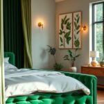
2. Bold & Beautiful: The Emerald Green Statement Wall

Ready to make a dramatic impact in your sleeping space? An emerald statement wall creates instant luxury and depth. This rich jewel tone transforms ordinary rooms into extraordinary retreats.
Choose your focal wall carefully for maximum effect. The wall behind your bed naturally draws attention. Walls with architectural features like fireplaces or built-ins work beautifully too.
Consider your room’s layout before committing. Walls facing natural light show the color’s true richness. Spaces with limited light may need strategic lighting adjustments.
Complementary colors balance the bold emerald beautifully. Navy blue velvet curtains add luxurious contrast. Crisp white bedding keeps the space feeling fresh and bright.
“A statement wall should enhance rather than dominate. The right complementary elements create harmony while letting the bold color shine.”
Metallic accents elevate the luxurious feel. Gold picture frames and hardware add warmth. Brass lamps and accessories create beautiful contrast against deep green.
Proper preparation ensures flawless results. Follow these steps for professional-looking walls:
- Clean surfaces thoroughly to remove dust and grease
- Repair any cracks or holes with spackling compound
- Apply high-quality primer for even color absorption
- Use painter’s tape for clean edges and sharp lines
- Apply two thin coats rather than one thick layer
Paint sheen affects the final look dramatically. Matte finishes hide imperfections but show marks. Eggshell offers subtle shine with easy cleaning.
Semi-gloss creates reflective depth but highlights flaws. Choose based on your wall condition and desired effect.
Accessorize your statement wall with intention. Large-scale artwork creates focal points without clutter. Mirrors reflect light and make spaces feel larger.
Floating shelves display decorative items beautifully. Keep arrangements simple to maintain the wall’s impact.
Choose furniture that complements without competing. Neutral-toned pieces let the wall shine. Natural wood finishes add warmth against cool green.
Lighting ensures your wall looks rich around the clock. Layer ambient, task, and accent lighting. Dimmable fixtures allow mood adjustment.
Warm white bulbs enhance emerald’s depth. LED strips behind headboards create beautiful glow effects.
This bold approach works with various interior styles:
| Design Style | How Emerald Wall Works | Best Complementary Elements |
|---|---|---|
| Modern Glam | Adds luxury and drama | Velvet, brass, marble |
| Traditional | Brings updated classic feel | Wood tones, patterned rugs |
| Transitional | Mixes classic and contemporary | Clean lines, mixed textures |
| Art Deco | Enhances geometric elements | Gold accents, mirrored surfaces |
Balance remains key with bold statements. Keep other walls neutral to prevent overwhelming. Repeat emerald tones in smaller accents throughout.
Textiles should coordinate without matching exactly. Patterned pillows can incorporate multiple colors. Solid bedding maintains calm against dramatic walls.
Your emerald statement wall becomes the room’s hero. Everything else supports its beauty. The result feels both dramatic and perfectly balanced.
This approach creates instant sophistication and depth. You’ll love how this rich transformation enhances your daily relaxation. Your personal sanctuary gains character and style.
3. Coastal Retreat: Pairing Seafoam Green with Navy and White
Transport yourself to a breezy seaside escape right in your personal space. Seafoam green captures that perfect ocean-side feeling with its refreshing blue-green tones. This soothing color palette creates an airy, relaxed atmosphere perfect for unwinding.
Benjamin Moore’s Palladian Blue offers a soft, sophisticated seafoam tone. Sherwin-Williams Raindrop provides a slightly cooler, more vibrant option. Farrow & Ball’s Blue Ground delivers a subtle, gray-infused version that feels effortlessly coastal.
Balance your seafoam walls with navy blue accents for classic nautical appeal. Crisp white elements keep the overall look fresh and bright. This timeless combination evokes beachside cottages without feeling overly themed.
“The best coastal designs feel collected rather than decorated. Choose pieces that suggest the seaside rather than scream it.”
Weathered wood furniture enhances the relaxed beach vibe beautifully. Driftwood finishes and whitewashed pieces work particularly well. Wicker or rattan accents add texture while maintaining that light, airy feel.
Choose bedding that whispers coastal comfort rather than shouting it. Soft cotton linens in white or cream create that perfect beach-house feel. Navy blue throw pillows add just the right pop of contrast.
Incorporate stripes in a sophisticated way through accent pieces. A navy and white striped blanket draped at the foot of the bed adds pattern. Subtle nautical motifs in artwork feel tasteful rather than tacky.
Accessorize with natural elements that suggest the seaside. A simple glass jar filled with sea glass makes a beautiful bedside accent. Framed marine charts or sailboat photography add personality.
Lighting should enhance the airy, beachy atmosphere. Woven rattan pendant lights diffuse light softly. White ceramic table lamps keep things bright and fresh after dark.
Maintain a relaxed, effortless vibe throughout your design choices. The best coastal spaces feel casually elegant rather than perfectly polished. Allow for some natural imperfection in your textures and finishes.
| Element | Coastal Choice | Effect Created |
|---|---|---|
| Wall Color | Benjamin Moore Palladian Blue | Soft, airy base |
| Accent Color | Navy blue textiles | Classic nautical contrast |
| Furniture | Weathered wood pieces | Relaxed, beachy feel |
| Textiles | Cotton linens, striped accents | Comfortable sophistication |
Your coastal retreat should feel like a permanent vacation. The right balance of colors and textures creates that effortless seaside charm. You’ll love waking up to this breezy, relaxed atmosphere every morning.
4. Earthy Elegance: Combining Green with Natural Wood Accents
There’s something truly special about the way natural wood elements complement green tones in a sleeping space. This approach creates what designers call “earthy elegance” – a perfect blend of sophistication and natural warmth.
Your space gains character through this harmonious combination. The organic textures of wood balance green’s calming effect beautifully.
Choose wood tones that enhance your specific green shade. Lighter woods like ash or maple work with soft sage walls. Rich walnut or cherry complement deeper emerald tones.
Mixing different wood finishes creates a collected, organic feel. Avoid matching everything perfectly. Instead, choose pieces with complementary undertones.
“The most interesting interiors layer wood finishes rather than match them. This creates depth and tells a story over time.”
Extend wood elements beyond furniture. Consider ceiling beams for architectural interest. Wood flooring adds warmth underfoot.
Your green shade should enhance rather than compete with wood tones. Soft greens with gray undertones work well with most woods. Avoid greens that clash with wood’s natural warmth.
Textiles bridge the gap between walls and wood surfaces. Natural linen curtains soften the transition. Wool throws add cozy texture against wood beds.
Lighting choices highlight both elements beautifully. Warm bulbs enhance wood’s richness. Directional lights create interesting shadows on textured surfaces.
Accessorize with other natural materials for depth. Stone side tables add earthy weight. Clay pottery brings handmade charm. Woven baskets offer functional storage.
Vary your textures to create visual interest. Combine smooth wood surfaces with nubby textiles. Add metallic accents for subtle shine.
Embrace natural imperfections for authentic character. Knotty wood tells a story. Slight variations in green paint add depth.
| Wood Type | Best Green Pairings | Created Atmosphere |
|---|---|---|
| Light Oak | Sage, Seafoam | Airy, relaxed |
| Walnut | Emerald, Forest | Rich, cocooning |
| Reclaimed | Olive, Moss | Rustic, authentic |
| Whitewash | Mint, Pastel | Coastal, fresh |
Your space should feel both elegant and grounded. The right balance creates a sanctuary that’s both stylish and comfortable.
Natural elements work together to create a cohesive design. You’ll love how this approach makes your room feel both refined and relaxing.
5. Vintage Vibes: Green Cabinetry and Antique Decor

Picture walking into a space that feels both timeless and personal. Vintage charm creates warmth through collected pieces and thoughtful colors. This approach blends history with comfort in your sleeping area.
Green cabinetry anchors the vintage look beautifully. It provides a nostalgic foundation for your decor. This color choice feels both classic and fresh.
Mossy green tones work particularly well for vintage styles. They suggest aged patina and natural weathering. These colors complement wood beams and original floors.
Benjamin Moore’s Saybrook Sage offers authentic vintage charm. Farrow & Ball’s Green Smoke provides deeper, moodier tones. Sherwin-Williams Rosemary brings herbal warmth to cabinetry.
“The best vintage spaces feel lived-in rather than perfect. Embrace slight imperfections that tell a story over time.”
Source antique furniture that complements your green palette. Look for pieces with similar wood tones and proportions. Don’t worry about matching everything exactly.
Distressing new pieces creates instant character. Light sanding on edges reveals underlying wood. Gentle hammer marks add authentic wear patterns.
Mix vintage elements with modern comforts for livability. Updated mattresses provide support beneath antique frames. Smart lighting integrates seamlessly with vintage fixtures.
Incorporate vintage patterns through textiles wisely. Toile patterns in green and cream add French country charm. Subtle floral prints maintain the nostalgic feel.
Lighting enhances the vintage atmosphere beautifully. Milk glass fixtures diffuse light softly. Brass sconces add warm, directional illumination.
Accessorize with finds that tell personal stories. Vintage books stacked on nightstands add character. Antique boxes provide hidden storage.
Balance prevents a cluttered or dated look. Edit your collections to showcase favorite pieces. Leave breathing room around special items.
Create cohesion through color repetition. Use your cabinet green in smaller accents throughout. This ties the space together intentionally.
| Element | Vintage Choice | Character Added |
|---|---|---|
| Cabinet Color | Mossy greens with gray undertones | Aged, authentic foundation |
| Furniture Style | Antique pieces with patina | Historical depth and warmth |
| Textile Patterns | Subtle florals, classic toile | Nostalgic softness |
| Lighting Fixtures | Reproduction antique designs | Period-appropriate ambiance |
Your vintage space should feel collected rather than decorated. Each piece contributes to the overall story. The result is a personal retreat full of character and charm.
6. Textural Dream: Using Throw Pillows and Linens for Depth
Think about how different fabrics feel against your skin. That sensory experience transforms your space from ordinary to extraordinary. Textures create visual interest and physical comfort in your personal retreat.
Your choice of materials makes a huge difference in the overall design. Soft cotton sheets feel cool and crisp. Fluffy wool throws provide cozy warmth on chilly nights.
Start with your foundation—the bedding itself. High-quality sheets set the tone for comfort. Layer additional textures through blankets and coverlets.
“Texture adds dimension without overwhelming a space. It’s the secret weapon for creating depth in monochromatic schemes.”
Choose throw pillows that complement your wall color. Woven patterns add subtle interest. Knitted covers bring handmade charm.
Mix sizes and shapes for visual appeal. Standard squares create a solid base. Bolster pillows add elegant lines. Round accents soften angular furniture.
Consider these winning combinations for different green walls:
| Wall Color | Pillow Textures | Linen Choices |
|---|---|---|
| Sage Green | Linen covers, embroidered details | Soft cotton percale |
| Emerald Green | Velvet pillows, tassel accents | Silk-blend sheets |
| Seafoam Green | Cotton knits, nautical stripes | Breathable linen |
Layer your bedding like a professional designer. Start with fitted and flat sheets. Add a lightweight blanket or coverlet. Top with a decorative quilt or duvet.
Fold throws neatly at the foot of your bed. Drape additional blankets over chairs or benches. This creates inviting warmth and visual depth.
Pattern mixing requires careful balance. Choose one dominant pattern for larger items. Use smaller-scale designs for accents. Solid textures help ground busy patterns.
Seasonal changes keep your space feeling fresh. Lightweight cotton and linen work beautifully in summer. Switch to flannel and wool when temperatures drop.
Unexpected elements add textural surprise. Woven wall hangings bring artistic texture. Beaded light fixtures cast interesting shadows.
Always balance rough with smooth surfaces. Pair nubby blankets with silky pillows. Combine woven rugs with polished wood floors.
Your final look should feel both inviting and intentional. Every texture should contribute to overall comfort. The result is a space you’ll love spending time in.
Remember that touch matters as much as appearance. Choose materials that feel wonderful against your skin. Your bedroom becomes a true sanctuary this way.
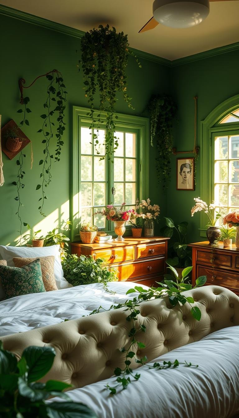
7. Botanical Bliss: Introducing Plants and Floral Patterns
Living plants take your nature-inspired retreat beyond simple color schemes. They add movement, texture, and life that paint alone cannot achieve. This approach creates a truly immersive experience in your personal space.
Plants bring dynamic energy through their growth and seasonal changes. They purify air while enhancing your overall well-being. The combination of living elements with your chosen palette creates authentic botanical charm.
Best Low-Light Plants for Bedrooms
Many sleeping areas receive limited direct sunlight. Fortunately, several beautiful varieties thrive in these conditions. These plants maintain their beauty while requiring minimal maintenance.
Snake plants stand upright with striking patterned leaves. They tolerate low light and irregular watering beautifully. Their architectural shape adds vertical interest to your decor.
Peace lilies offer graceful white blooms against dark green foliage. They indicate when they need water by slightly drooping. This makes them perfect for beginners.
ZZ plants feature glossy, waxy leaves that shine in any light. They grow slowly and require very little attention. Their deep green color complements various wall tones.
Pothos vines trail beautifully from shelves or hanging planters. They adapt to various light conditions effortlessly. Their heart-shaped leaves add softness to your space.
“Bedroom plants should enhance tranquility rather than create maintenance stress. Choose varieties that match your lifestyle and light conditions.”
Position plants near windows to maximize available light. Rotate them periodically for even growth. Wipe leaves occasionally to maintain their natural shine.
Water requirements vary among different species. Most bedroom plants prefer slightly dry soil between waterings. Use your finger to test moisture levels before adding water.
Using Wallpaper and Artwork for a Botanical Feel
Floral patterns extend your nature theme throughout the space. They create visual interest without overwhelming the senses. The right patterns enhance rather than compete with living plants.
Botanical wallpaper makes a stunning statement behind your bed. Choose designs with subtle green tones that complement your walls. Large-scale patterns work beautifully in spacious areas.
Smaller prints create delicate accents in cozy spaces. They add pattern without dominating the room. These work well in reading nooks or dressing areas.
Artwork brings botanical elements to vertical surfaces. Pressed flower arrangements under glass offer timeless elegance. Botanical prints in simple frames maintain a clean look.
Consider these options for different bedroom styles:
| Style | Plant Choices | Pattern Suggestions |
|---|---|---|
| Modern | Snake plants, ZZ plants | Minimalist floral prints |
| Traditional | Peace lilies, ferns | Classical botanical illustrations |
| Coastal | Pothos, spider plants | Nautical-themed patterns |
Mix real and artificial plants for consistent greenery year-round. High-quality silk plants provide maintenance-free options. Place them in areas with challenging light conditions.
Seasonal rotations keep your space feeling fresh. Flowering plants add color during spring and summer. Evergreen varieties maintain interest through colder months.
Your botanical elements should work together harmoniously. Choose a cohesive color story that connects all components. The result feels both intentional and effortlessly beautiful.
8. Painted Floors and Furniture: Unexpected Green Touches

Have you considered giving your surfaces a fresh coat of paint? This creative approach transforms ordinary elements into standout features. Painting floors and furniture offers a budget-friendly way to refresh your space.
Grassy green floors create a camp-style atmosphere that feels both playful and peaceful. This bold choice sets a vibrant foundation for your entire room.
Avocado-toned chairs bring eclectic charm to seating areas. Mismatched pieces gain cohesion through unified color. Your space develops personality through these intentional touches.
“Painted surfaces add character while allowing for personal expression. The right preparation ensures lasting beauty and durability.”
Existing cabinetry gains new life with a green refresh. This update brings natural warmth without replacement costs. Your storage solutions become design statements.
Proper preparation ensures professional results. Follow these steps for different surfaces:
- Clean thoroughly to remove dirt and grease
- Sand smooth for better paint adhesion
- Apply primer suitable for each material type
- Use quality brushes for smooth application
- Allow proper drying time between coats
Some pieces work better for painting than others. Solid wood furniture accepts paint beautifully. Veneer surfaces require special preparation.
Natural wood grains should remain visible on special pieces. Antique items might lose value with paint. Consider each piece’s unique characteristics.
Floor patterns add visual interest to your space. Geometric designs create modern energy. Free-form patterns offer organic charm.
Choose green shades that complement your wall color. Lighter floors work with darker walls. Deeper floor tones balance pale walls.
High-traffic areas need special protection. Quality polyurethane seals painted surfaces. Choose matte or satin finishes for best wear.
Thrifted finds become designer pieces with paint. Outdated furniture gains contemporary style. Your creativity transforms ordinary items.
Area rugs protect painted floors while adding comfort. Choose sizes that show some painted surface. Natural fiber rugs complement the green palette.
Balance painted elements with other materials. Wood tones provide natural contrast. Metallic accents add subtle shine.
Maintenance keeps your surfaces looking fresh. Gentle cleaning preserves the finish. Touch-up paint handles minor scratches.
| Surface Type | Best Green Shades | Protection Needed |
|---|---|---|
| Wood Floors | Mossy greens, soft sage | 3-4 coats polyurethane |
| Furniture | Avocado, deep emerald | 2-3 coats protective finish |
| Cabinetry | Olive, muted forest | Durable enamel paint |
Your painted elements should feel intentional and cohesive. The right combination creates a unique personal space. You’ll love how these touches transform your room.
9. Dark and Moody: Cocooning with Deep Green Tones
There’s something incredibly intimate about wrapping yourself in deep, moody green tones at the end of a long day. These rich shades create a cocooning effect that makes your sleeping area feel like a protective embrace.
Deep greens like Sherwin-Williams Muddled Basil envelop you in warmth and comfort. This approach transforms your personal space into a true sanctuary from the outside world.
Painting walls, trim, and ceiling the same deep shade creates seamless continuity. This technique eliminates visual breaks that can make a room feel smaller. The result is a beautifully cohesive look.
Farrow & Ball’s Douter offers a smoky grey-green option for sophisticated moodiness. Their Reduced Green provides a sultry dark neutral that works with various decor styles.
“Deep green spaces create psychological safety and intimacy. They’re perfect for people seeking refuge from daily stimulation and overstimulation.”
Smaller bedrooms actually benefit from this approach when done correctly. The cocooning effect makes compact spaces feel intentionally cozy rather than cramped. Strategic lighting prevents any closed-in feeling.
Lighting strategies are crucial for dark green rooms. Layer multiple light sources at different heights. Warm-toned bulbs create golden glows against deep walls.
Table lamps with fabric shades diffuse soft light beautifully. Sconces mounted at eye level provide flattering illumination. Dimmer switches allow mood adjustment throughout the evening.
Balance dark walls with lighter elements to prevent overwhelming darkness. Crisp white bedding creates striking contrast against deep green backgrounds. Natural wood tones add warmth and visual relief.
Choose textiles that complement rather than fight your dark walls. Cream-colored linens offer soft contrast. Textured throws in neutral tones add comfort without competing.
Metallic accents pop dramatically against dark green backgrounds. Brass lamp bases catch and reflect light beautifully. Gold picture frames add luxurious touches throughout your space.
This aesthetic works particularly well for people seeking calm retreats. Those who appreciate drama and sophistication will love this approach. It’s perfect for creating evening-focused sanctuaries.
Create contrast and interest through texture and pattern. Velvet pillows add luxurious softness against matte walls. Woven baskets provide organic texture for storage solutions.
Testing dark green colors requires special attention. These shades often look dramatically different on walls than samples. Paint large swatches and observe them for several days.
View colors in both natural and artificial light. Notice how they change from morning to evening. Live with the samples before making final decisions.
According to Elle Decor’s dark green bedroom ideas, these rich tones create truly enveloping spaces that balance sophistication with comfort.
| Paint Color | Undertones | Best For |
|---|---|---|
| Muddled Basil | Earthy, muted | Cozy traditional spaces |
| Farrow & Ball Douter | Smoky grey-green | Modern sophisticated rooms |
| Reduced Green | Sultry dark neutral | Transitional design schemes |
Your dark green sanctuary should feel both dramatic and deeply comforting. The right balance creates a space that’s both bold and restful. You’ll love retreating to this cozy haven every evening.
10. The Pastel Palette: Mint Green and Soft Pastels
Pastel palettes offer a sophisticated approach to creating serene bedroom environments. These soft hues provide gentle visual interest without overwhelming your senses. The result is a space that feels both refreshing and deeply calming.
Mint green stands out as a particularly versatile pastel choice. Its cool undertones create an airy, spacious feel in any room. This shade works beautifully for creating that peaceful retreat you deserve.
Specific paint colors deliver exceptional results for your walls. Farrow & Ball’s Cooking Apple Green offers a soft, herbal quality that feels both fresh and timeless. This particular shade creates subtle warmth without appearing too sweet.
Farrow & Ball’s Cromarty provides a slightly cooler alternative with gray undertones. This sophisticated option works particularly well in north-facing rooms. It maintains that soft pastel quality while offering more depth.
“Pastel greens achieve sophistication through their subtle complexity. The best shades contain enough gray or blue undertones to prevent childish associations.”
Combining mint with other pastels creates harmonious layered effects. Soft lavender accents add complementary contrast without overwhelming. Pale blue tones enhance the cool, refreshing quality of mint green.
Consider these elegant pastel combinations:
| Primary Color | Complementary Pastel | Effect Created |
|---|---|---|
| Mint Green | Soft Lavender | Fresh yet soothing atmosphere |
| Pale Sage | Dusty Rose | Earthy romantic feel |
| Seafoam Green | Pale Blue | Coastal breezy vibe |
If you prefer neutral walls, incorporate pastels through accessories instead. Mint green throw pillows add pops of color against white or beige backgrounds. Pastel artwork creates focal points without permanent commitment.
Choose furniture that complements rather than competes with soft colors. Light wood finishes maintain the airy quality of pastel schemes. White or cream painted pieces create cohesive, light-enhancing surfaces.
Create depth in your pastel space through thoughtful texture layering. Nubby linen curtains add visual interest against smooth walls. Woven baskets provide organic texture while offering practical storage.
Lighting plays a crucial role in pastel rooms. Natural light enhances the soft quality of these colors beautifully. Sheer curtains diffuse sunlight while maintaining brightness.
Artificial lighting should complement the gentle atmosphere. Warm white bulbs prevent pastels from appearing cold or sterile. Dimmable fixtures allow mood adjustment throughout the day.
Seasonal adaptations keep your pastel palette feeling fresh year-round. Lightweight cotton textiles work perfectly for summer months. Switch to warmer wool throws when temperatures drop.
Balance soft colors with enough contrast to prevent a washed-out look. Dark wood frames on artwork anchor the space effectively. Black metal lamp bases provide subtle definition.
Creating sophisticated pastel schemes involves careful editing. Choose a limited color palette of two or three complementary tones. Repeat these colors throughout your space for cohesive elegance.
Your pastel retreat should feel intentionally designed rather than accidentally matchy. The right balance creates a space that’s both softly beautiful and perfectly adult.
11. Green and Blue Harmony: Creating a Tranquil Oasis

Have you noticed how nature often pairs lush greenery with serene blue skies and waters? This perfect natural balance creates an incredibly peaceful atmosphere you can bring into your personal space. These two colors work together beautifully to craft a restful retreat.
Color theory explains why this combination feels so harmonious. Green and blue sit next to each other on the color wheel. They share cool undertones that create visual harmony without competing for attention.
Different pairings create unique moods in your sleeping area. Sage green with soft sky blue feels airy and refreshing. Deep forest green with navy blue creates a cozy, enveloping feel.
“Analogous color schemes using green and blue create visual harmony that’s inherently calming to the human nervous system.”
Balance your color proportions carefully. A green accent wall with blue bedding creates perfect equilibrium. Blue curtains against green walls maintain visual interest without overwhelming.
Consider these winning combinations:
| Green Shade | Blue Partner | Created Atmosphere |
|---|---|---|
| Sage Green | Powder Blue | Soft, airy freshness |
| Emerald Green | Navy Blue | Rich, sophisticated depth |
| Seafoam Green | Aqua Blue | Coastal breezy vibe |
| Olive Green | Steel Blue | Earthy, grounded feel |
Choose undertones that work together rather than clash. Green with blue undertones pairs beautifully with cool blues. Green with yellow undertones works better with warmer blue shades.
Neutral elements ground your color scheme effectively. White trim creates crisp definition between green and blue areas. Natural wood tones add warmth that prevents the cool palette from feeling too cold.
Test your combinations before committing fully. Paint large swatches of both colors on adjacent walls. Observe how they interact throughout the day under different lighting conditions.
Create ombre effects for subtle transitions. Blend green walls into blue ceilings for a sky-like effect. Gradient artwork incorporates both colors in a flowing, organic way.
Patterns help integrate both colors cohesively. Botanical prints with green leaves and blue backgrounds work beautifully. Striped bedding alternating green and blue bands creates rhythmic harmony.
Your final palette should feel both refreshing and deeply calming. The right combination transforms your room into a true oasis. You’ll love how this harmonious blend enhances your daily relaxation.
12. Modern Cottage: Green Front Doors and Wicker Details
What if your personal space could blend cozy tradition with fresh simplicity? Modern cottage style achieves this perfect balance. It mixes nostalgic elements with clean, contemporary lines.
This approach creates a bedroom that feels both timeless and current. You get the comfort of classic cottage charm without dated details. The result is a space that welcomes you with open arms.
Green elements play a crucial role in this aesthetic. They bring natural warmth to your room while maintaining freshness. The right shades create that perfect cottage look.
“Modern cottage design celebrates simplicity and authenticity. It’s about creating spaces that feel collected rather than decorated.”
Start with painted elements that set the cottage tone. A green front door creates a charming entry point to your sleeping area. This colorful touch makes your space feel special from the moment you enter.
Consider painting built-ins or accent furniture in complementary greens. A nightstand in deep blue-green adds character. These painted touches bring cottage charm without overwhelming.
Wicker and rattan pieces add texture and casual elegance. A rattan headboard brings organic warmth to your bed. Wicker chairs create cozy reading nooks in corners.
Mix old and new elements for authentic character. Pair antique wooden pieces with modern bedding. Combine vintage finds with contemporary lighting fixtures.
Choose green shades that enhance rather than fight cottage aesthetics. Softer greens with gray undertones work beautifully. These colors feel both fresh and nostalgic.
Patterns and textiles complete the modern cottage design. Simple gingham checks add classic charm. Subtle floral prints bring gentle pattern without overwhelming.
Lighting should complement both modern and cottage aspects. Wicker pendant lights offer texture and soft illumination. Simple sconces provide clean lines with warm light.
Accessorize with pieces that tell personal stories. Family photos in simple frames add heart. Collected treasures display your journey and memories.
Maintain a clean, uncluttered look while embracing cottage charm. Edit your collections to showcase favorite pieces. Leave breathing room around special items.
| Element | Modern Cottage Choice | Effect Created |
|---|---|---|
| Wall Color | Soft sage with gray undertones | Fresh yet nostalgic base |
| Painted Accents | Deep blue-green on doors or furniture | Characterful focal points |
| Textiles | Gingham checks, subtle florals | Classic pattern mixing |
| Lighting | Wicker pendants, simple sconces | Texture and warm illumination |
Your modern cottage decor should feel both personal and polished. The right balance creates a space that’s both comfortable and stylish. You’ll love how this approach makes your room feel like home.
Selecting the Perfect Bedding to Complement Your Green Palette
Your bedding choices transform your space from ordinary to extraordinary. The right selection enhances your overall design while providing ultimate comfort. This decision impacts both aesthetics and your daily relaxation experience.
Natural materials create the foundation for restful sleep. They regulate temperature and feel wonderful against your skin. These fabrics contribute to that cozy sanctuary feel you desire.
Your color choices should harmonize with wall tones. The right combinations create visual balance and cohesion. Everything works together to enhance your peaceful retreat.
Breathable Materials: Cotton and Linen
Cotton remains a top choice for bedroom environments. Its natural fibers allow air circulation throughout the night. This keeps you comfortable during warmer months.
High-quality cotton feels soft and becomes more comfortable over time. Higher thread counts offer smoother surfaces against your skin. These sheets provide lasting luxury for your sleeping area.
Linen brings beautiful texture and excellent breathability. It wicks moisture away from your body naturally. This fabric keeps you cool in summer and warm in winter.
“Natural fiber bedding regulates temperature better than synthetic alternatives. This contributes to more restful sleep throughout the night.”
Consider these benefits when choosing your materials:
| Material | Best Features | Ideal For |
|---|---|---|
| Egyptian Cotton | Softness, durability | Year-round comfort |
| Belgian Linen | Breathability, texture | Warm climates |
| Organic Cotton | Hypoallergenic, sustainable | Sensitive skin |
Layer different weights for seasonal adaptability. Lightweight cotton works perfectly for summer. Add flannel or wool layers during colder months.
Your investment in quality bedding pays off through better sleep. These materials maintain their appearance through numerous washes. They become softer and more comfortable over time.
Pattern Play: Gingham, Florals, and Subtle Geometrics
Patterns add visual interest without overwhelming your space. They create depth and personality in your sleeping area. The right choices complement rather than compete with walls.
Gingham offers classic charm that feels both fresh and nostalgic. Its regular pattern creates rhythm without busyness. This works beautifully with various green shades.
Floral patterns bring organic beauty to your bedding. Choose designs with similar tones to your wall color. This creates harmony throughout your space.
Subtle geometrics add modern sophistication. They provide visual interest without traditional associations. These patterns work well in contemporary spaces.
Consider these pattern guidelines for different green walls:
- Soft sage walls: delicate florals or small-scale gingham
- Deep emerald walls: larger geometric patterns or tone-on-tone designs
- Seafoam green walls: nautical stripes or watery floral motifs
Mix patterns carefully for balanced appeal. Choose one dominant pattern for larger items. Use smaller-scale designs for accent pillows.
Solid textures help ground busy patterns. They provide visual breathing room in your design. This prevents your space from feeling overwhelming.
Your pattern choices should reflect your personal style. They contribute to the overall look you want to achieve. The right combinations create a space that feels uniquely yours.
Remember that bedding serves both aesthetic and functional purposes. Your selections should offer comfort alongside visual appeal. This balance creates the perfect sleeping environment.
Lighting Your Green Bedroom for a Calming Ambiance
Think about how the right illumination can completely transform your personal retreat. Proper lighting enhances your chosen palette while setting the perfect mood for relaxation. It’s the secret ingredient that brings your entire design together beautifully.
Natural and artificial sources work together to create harmony. They highlight your favorite features while providing practical functionality. The balance between them makes your space feel both inviting and restful.
Harnessing Natural Light with Sheer Curtains
Window treatments play a crucial role in managing sunlight throughout the day. Sheer fabrics allow soft illumination to filter into your space gently. They maintain privacy while keeping things bright and airy.
Position furniture to take advantage of natural light patterns. Place your bed where morning sun creates a gentle wake-up effect. Reading chairs benefit from afternoon illumination for cozy relaxation.
Different green shades interact uniquely with sunlight throughout the day. Soft pastels glow beautifully in morning light. Deeper tones gain richness as evening approaches.
Adjustable window coverings offer flexibility for changing conditions. Layer sheers with blackout liners for complete control. This lets you adapt to different times and seasons effortlessly.
Choosing Warm, Soft Artificial Lighting
Artificial sources complement natural light when the sun goes down. Warm-toned bulbs create a cozy glow that harmonizes with green walls. They prevent harsh contrasts that can disrupt your peaceful atmosphere.
Dimmable LED fixtures allow adjustable brightness aligned with natural cycles. You can mimic daylight patterns for consistent comfort. Smart controls make these adjustments automatic and effortless.
“Layered lighting creates depth and dimension in any space. The combination of ambient, task, and accent sources provides both beauty and functionality.”
Consider these lighting types for different activities:
- Ambient lighting provides overall illumination for general use
- Task lighting focuses on specific areas like reading nooks
- Accent lighting highlights architectural features or artwork
Fixture styles should enhance rather than detract from your design. Simple silhouettes keep attention on your beautiful walls. Natural materials like wood or rattan complement the organic feel.
Lamp shades play a crucial role in diffusing light softly. Fabric covers create gentle illumination without glare. Their color and texture contribute to the overall ambiance.
Strategic placement ensures both functionality and atmosphere. Bedside lamps offer convenient reading light. Overhead fixtures provide general illumination when needed.
Your lighting plan should support various moods and activities. Bright light for morning routines helps you start the day. Softer evening lighting prepares your mind for restful sleep.
Smart systems integrate everything for seamless control. Programmable settings adjust automatically throughout the day. Voice commands or apps make changes quick and easy.
The right illumination makes your space feel both practical and magical. It highlights your design choices while providing everyday functionality. You’ll love how proper lighting completes your peaceful retreat.
Accessorizing Your Space: Rugs, Art, and Final Touches
Those final decorative elements truly bring your vision together. They add personality while creating that polished, complete appearance you want. Thoughtful accessories transform your area from simply decorated to fully designed.
These finishing touches reflect your unique style and interests. They make the space feel authentically yours rather than generic. Every piece should contribute to the overall harmony.
Choosing a Rug to Anchor the Room
Area rugs define your layout while adding comfort underfoot. They create visual boundaries that organize your furniture arrangement. The right choice ties everything together beautifully.
Natural fiber options like jute offer casual elegance with organic texture. Their neutral tones complement various green shades without competing. These materials provide excellent durability for high-traffic areas.
Consider size and placement carefully. Your rug should extend beyond the bed on three sides. This creates a comfortable landing space when you get up.
Pattern and color choices depend on your wall shade. Solid rugs work well with patterned bedding. Patterned rugs balance solid color schemes.
Texture adds dimension to your flooring choices. Plush piles feel luxurious under bare feet. Flat weaves offer easier cleaning and maintenance.
“The right rug anchors the entire room visually while providing physical comfort. It’s the foundation that connects all other elements together.”
Maintenance requirements vary between materials. Natural fibers may require professional cleaning. Synthetic options often handle home cleaning well.
Consider these rug options for different green palettes:
| Green Shade | Rug Material | Pattern Suggestion |
|---|---|---|
| Soft Sage | Jute or Sisal | Subtle geometric or solid |
| Deep Emerald | Wool or Polyester | Traditional patterns or textured solid |
| Seafoam Green | Cotton or Polypropylene | Nautical stripes or organic motifs |
Curating a Gallery Wall with Green Tones
Artwork personalizes your space while reinforcing your color story. A well-planned display creates visual interest without clutter. It becomes a focal point that reflects your taste.
Choose pieces that incorporate your green palette naturally. Botanical prints work beautifully with nature-inspired decor. Abstract art with green accents maintains modern appeal.
Frame selection unifies diverse artwork effectively. Matching frames create a cohesive grid arrangement. Mixed frames offer eclectic charm when carefully coordinated.
Arrange your layout before making any holes. Lay pieces on the floor to experiment with spacing. Use paper templates to visualize the final arrangement.
Balance large and small pieces for visual harmony. Place larger works toward the center or bottom. Smaller pieces fill gaps and create rhythm.
Consider these arrangement styles for different spaces:
- Grid layout for symmetrical, organized appearance
- Salon style for eclectic, collected feel
- Vertical stack for narrow wall spaces
- Horizontal line for above furniture placement
Lighting highlights your artwork effectively. Picture lights illuminate specific pieces beautifully. Adjustable track lighting offers flexible highlighting options.
Personal photographs blend seamlessly with purchased art. Black and white images create cohesion among colorful pieces. Similar matting and framing styles unite diverse subjects.
Your gallery should feel intentionally edited rather than overcrowded. Leave breathing room between pieces for visual rest. The overall effect should enhance rather than overwhelm your space.
Final accessories complete your personalized retreat. Decorative plant pots in harmonizing colors uplift the aesthetic. Carefully chosen objects add those finishing touches that make the space truly yours.
Edit your collections to maintain visual calm. Each piece should have purpose and meaning. The result feels both personal and perfectly polished.
Bringing Your Green Bedroom Vision to Life
Creating your perfect nature-inspired retreat starts with thoughtful planning. Begin by assessing your current space and identifying what works well already. This approach saves time and resources while building on existing strengths.
Develop a step-by-step plan that prioritizes changes based on your budget and skills. Simple paint updates often deliver the biggest impact for the least investment. More complex projects might need professional assistance.
Trust your personal taste while applying fundamental design principles. Your space should reflect your unique style and comfort needs. The result becomes a true sanctuary that supports relaxation and renewal.
Remember that beautiful spaces often evolve gradually over time. Each thoughtful addition brings you closer to your ideal retreat. Your patience and creativity will transform your area into something truly special.